"MindMemo" is your digital companion for enhanced self-care and mental well-being. It is an interactive diary/journal designed to empower users with AI-driven therapeutic support. The artifact takes the external form of a typical diary, but when opened, it reveals two screens, one on the left and one on the right. Users can freely express their thoughts, emotions, and problems by writing on the right page using the attached “MindPen”. When the journal is reopened, the AI analyzes the content and provides personalized feedback, coping strategies, and valuable resources. MindMemo harnesses the power of technology to bridge the gap between self-expression and professional guidance, making self-care an enriching and insightful journey. It provides a progress feature and adapts to users' needs, whether they seek solace during global crises or face immediate personal challenges. With MindMemo, every journal entry becomes an opportunity for growth, resilience, and improved mental well-being.
*This project was conducted with a quick 2-week turnaround. I plan on revisiting the concept and developing my designs further sometime in the future.
1) Establishing objectives, features, and analogous solutions
I first began by defining what I wanted MindMemo to accomplish and through what technical features, as well as by researching what other similar solutions exist that I could draw inspiration from.
I first began by defining what I wanted MindMemo to accomplish and through what technical features, as well as by researching what other similar solutions exist that I could draw inspiration from.
2) Moodboard & Inspiration
I then looked into sources for visual inspiration, identifying products, interfaces, and ideas that could inform my artifact. I looked a lot at mental health apps, typical journal entries, as well as dual-screen foldable devices.
I then looked into sources for visual inspiration, identifying products, interfaces, and ideas that could inform my artifact. I looked a lot at mental health apps, typical journal entries, as well as dual-screen foldable devices.
3) Storyboard & Sketches
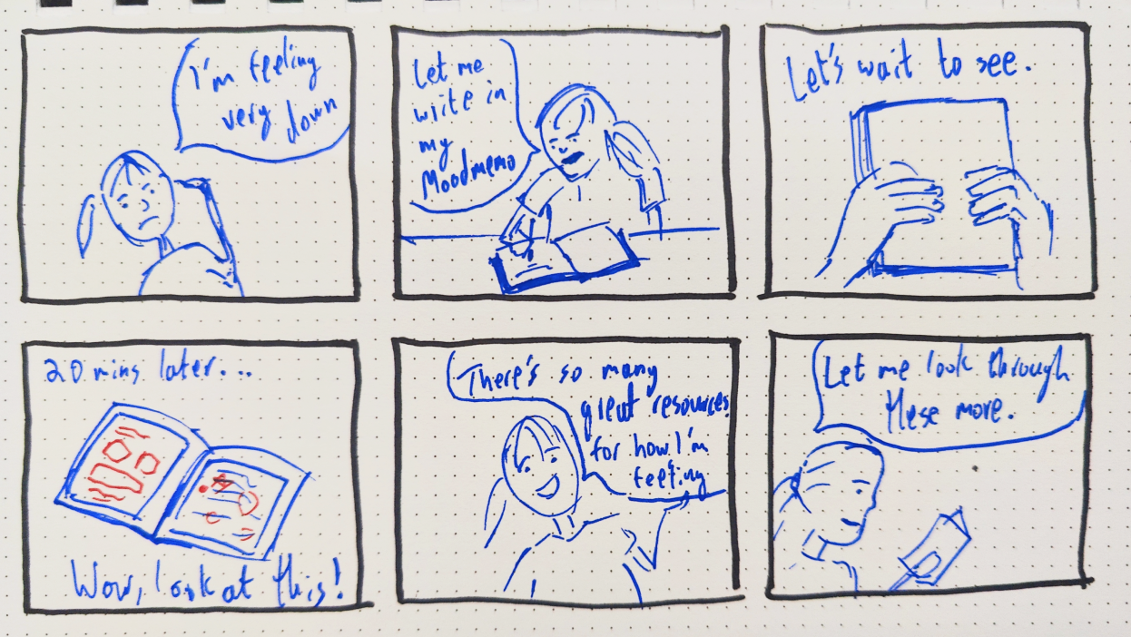
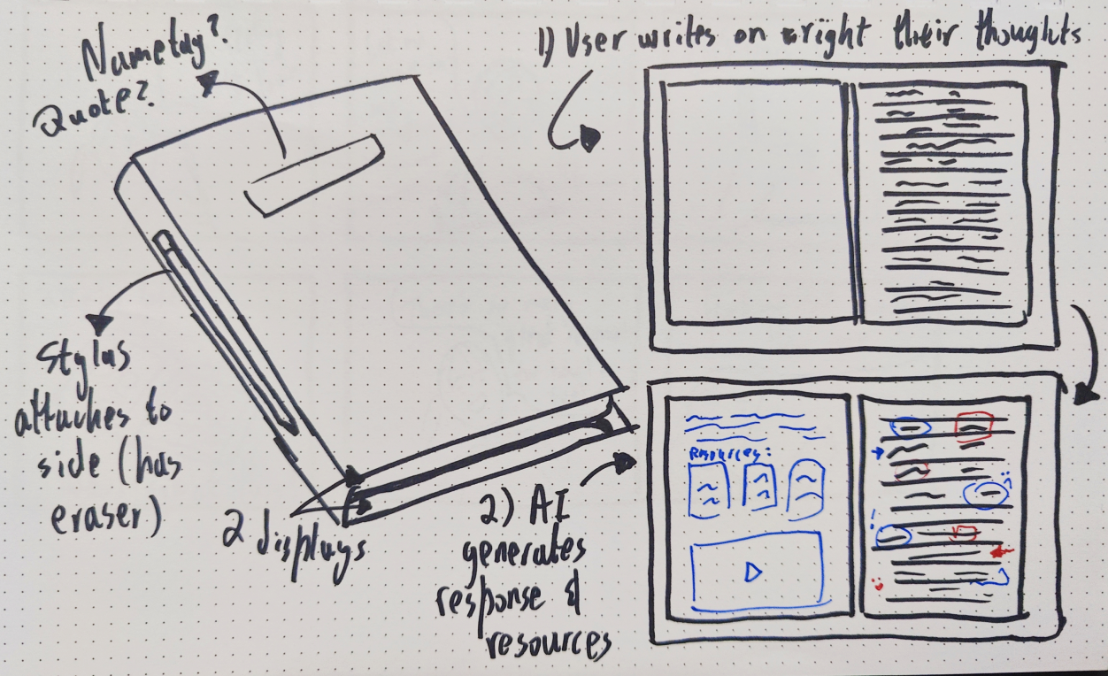
I developed a storyboard showing how I envisioned the interaction with the artifact to look like and also drew a rough sketch of the outside and inside of the journal to create a preliminary visualization of my idea.
I developed a storyboard showing how I envisioned the interaction with the artifact to look like and also drew a rough sketch of the outside and inside of the journal to create a preliminary visualization of my idea.
4) Lo-fis
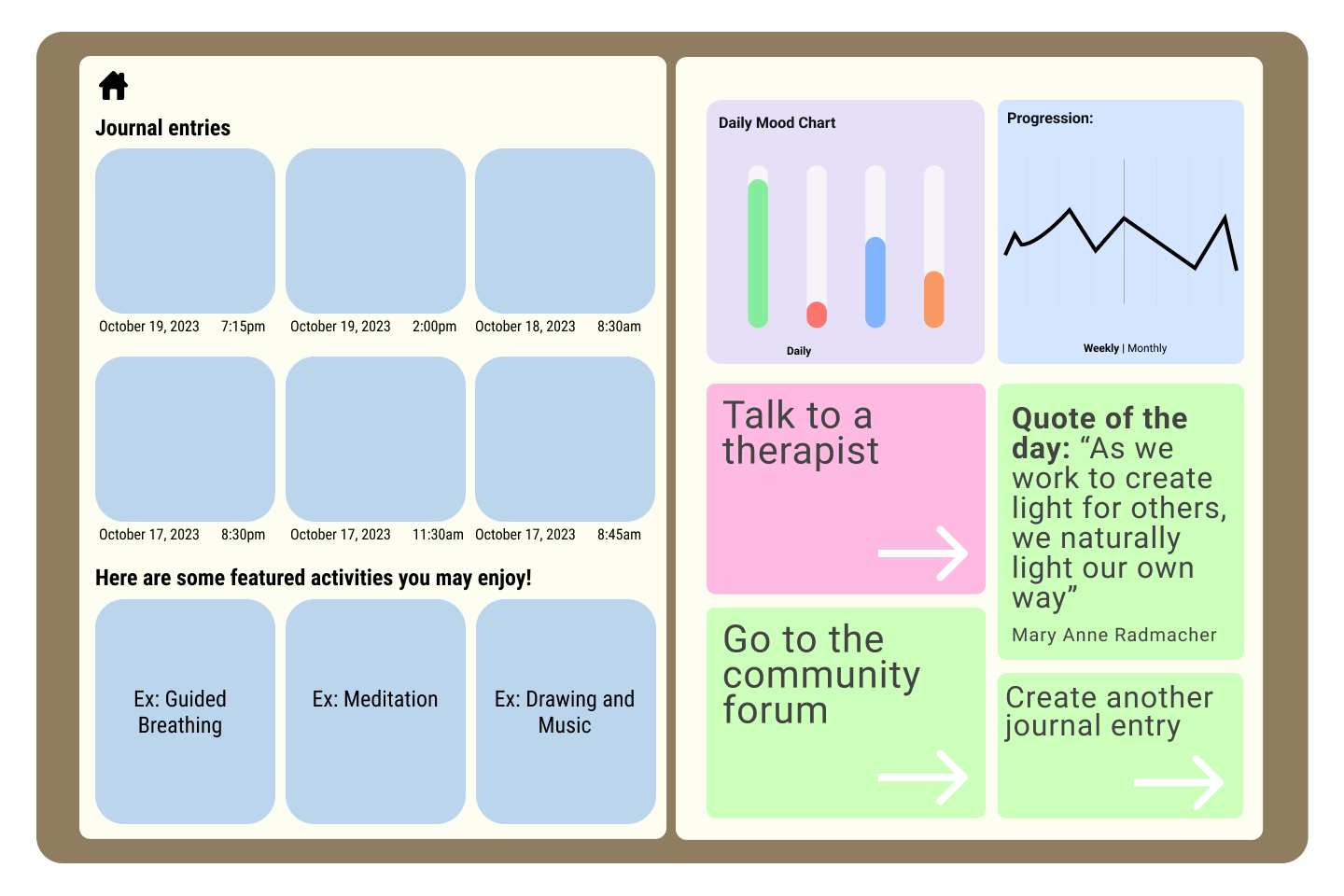
To get started on actually creating the artifact, I designed low-fidelity wireframes that show the basic layout/architecture of the various different interfaces and features that I want to include.
To get started on actually creating the artifact, I designed low-fidelity wireframes that show the basic layout/architecture of the various different interfaces and features that I want to include.
5) Iterating on Lo-fis
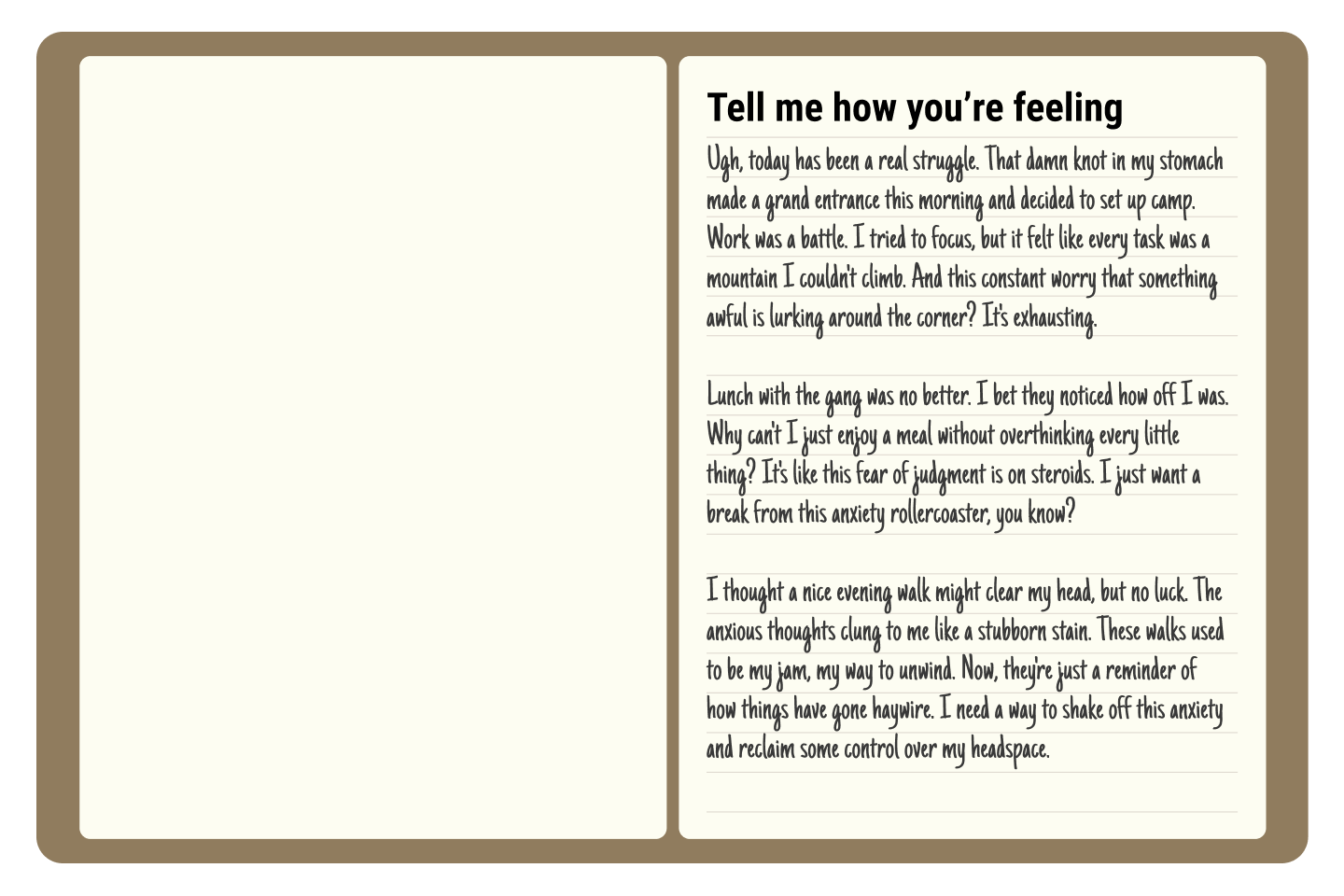
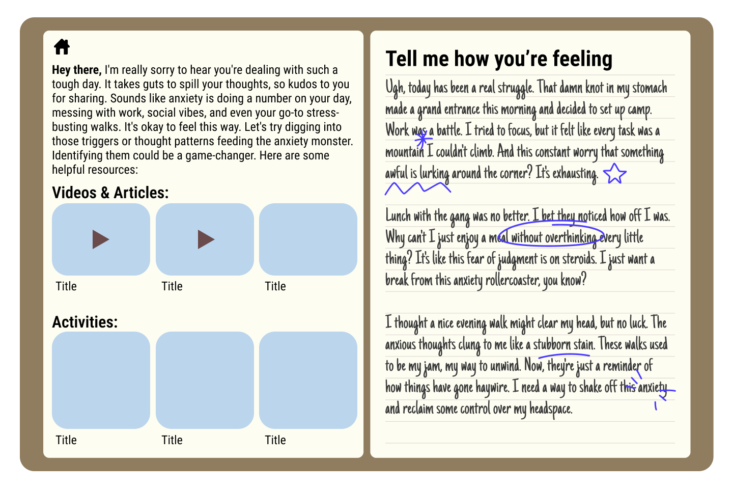
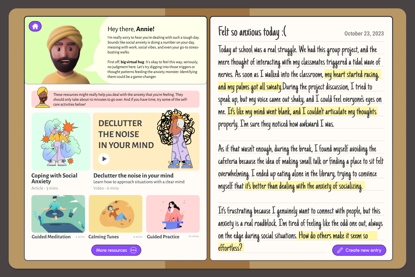
I developed my lo-fis further by writing an example journal entry and showcasing how the AI might interact with it, providing specific videos, articles, activities, etc. I also expanded on the appearance and composition of the home page.
I developed my lo-fis further by writing an example journal entry and showcasing how the AI might interact with it, providing specific videos, articles, activities, etc. I also expanded on the appearance and composition of the home page.
6) User Testing
I conducted user testing with a group of friends, explaining my concept, showcasing my current iteration, and asking them to list strengths in the current design/solution, weaknesses, confusions, questions, and opportunities for improvement. I identified common themes and reflected a lot on the feedback that I received before moving onto my final iteration. Some highlights included implementing an avatar, a more appealing design system, a better commenting system, and a hub where users can access all content.
I conducted user testing with a group of friends, explaining my concept, showcasing my current iteration, and asking them to list strengths in the current design/solution, weaknesses, confusions, questions, and opportunities for improvement. I identified common themes and reflected a lot on the feedback that I received before moving onto my final iteration. Some highlights included implementing an avatar, a more appealing design system, a better commenting system, and a hub where users can access all content.
7) Design System
The next step was establishing a design system, which included a collection of reusable components for my final design. This included specific typefaces, colors, avatar styles, and more. This made it a lot easier to build various pages for my final prototype.
The next step was establishing a design system, which included a collection of reusable components for my final design. This included specific typefaces, colors, avatar styles, and more. This made it a lot easier to build various pages for my final prototype.
8) Final Iteration & Prototype
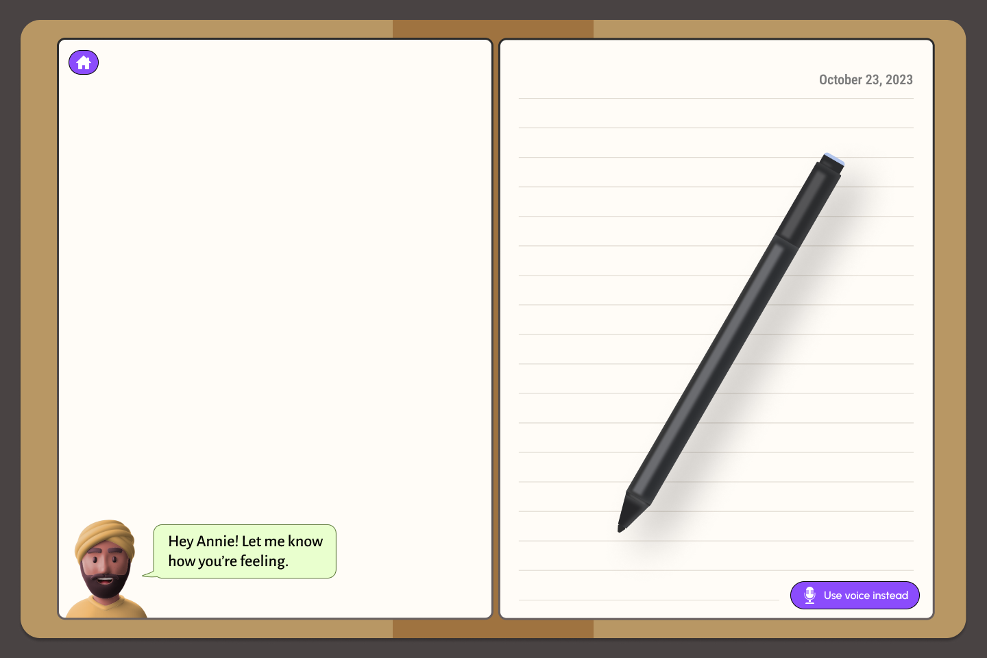
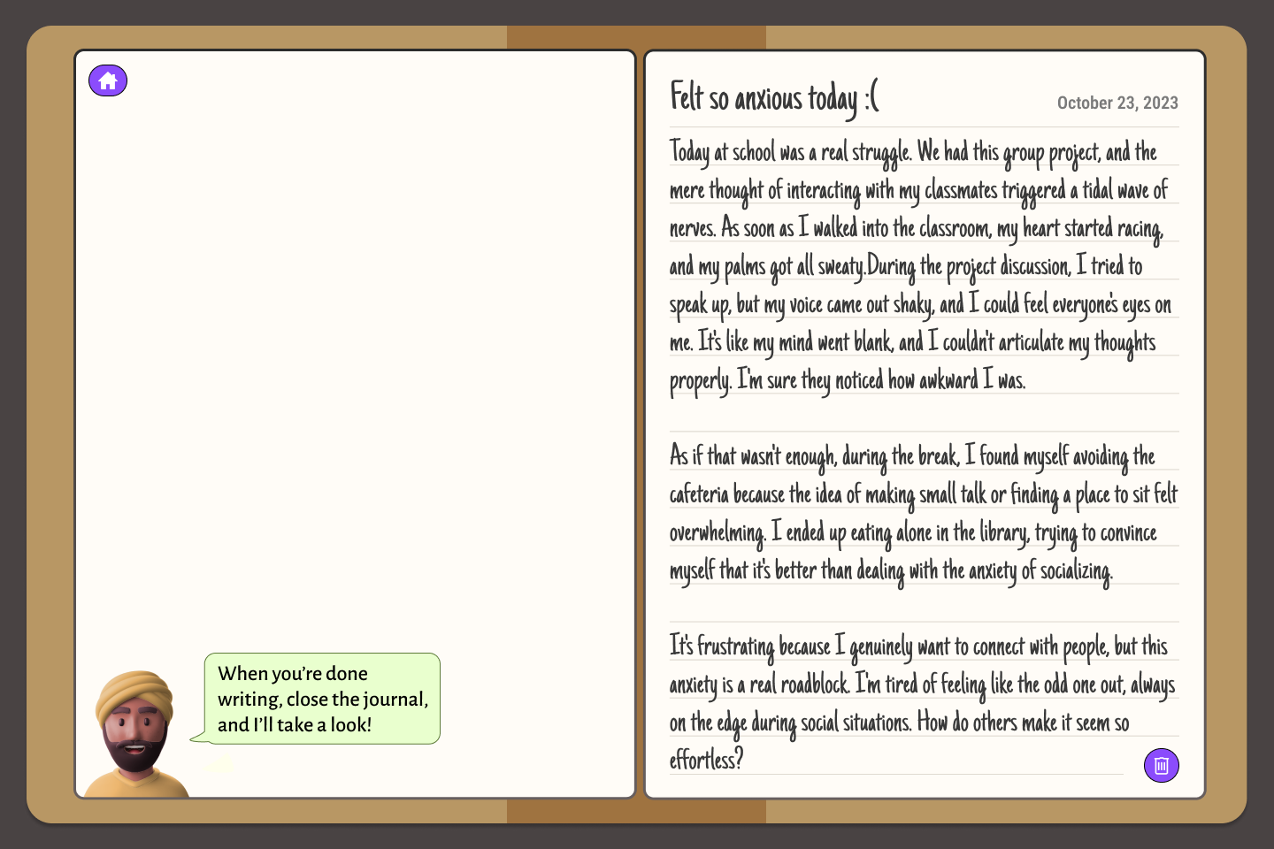
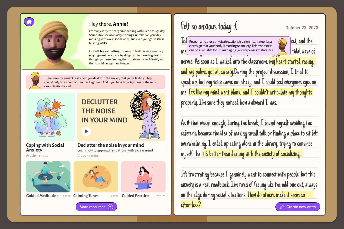
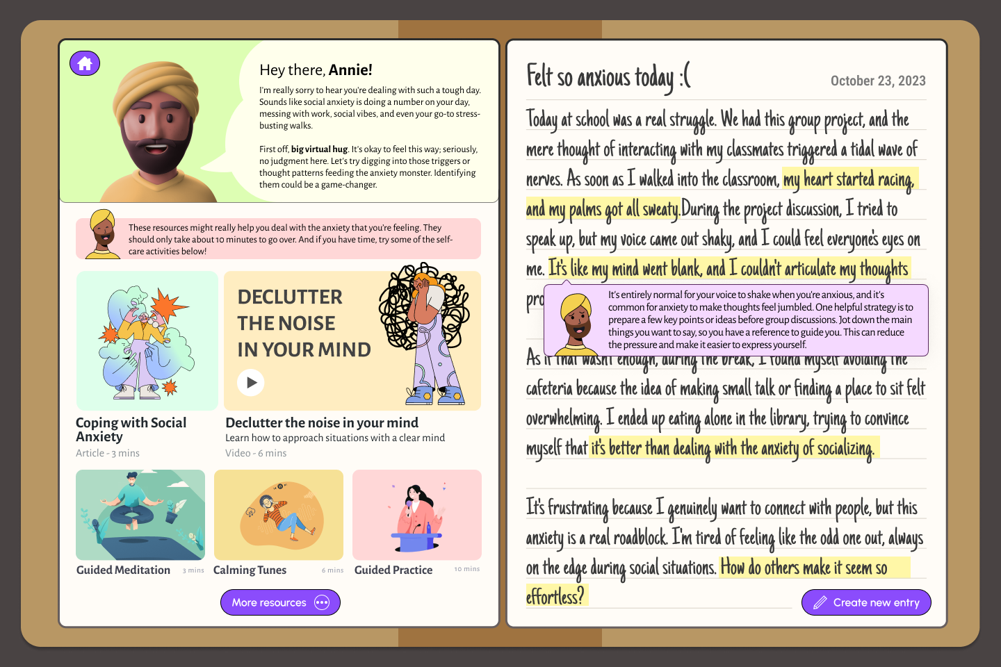
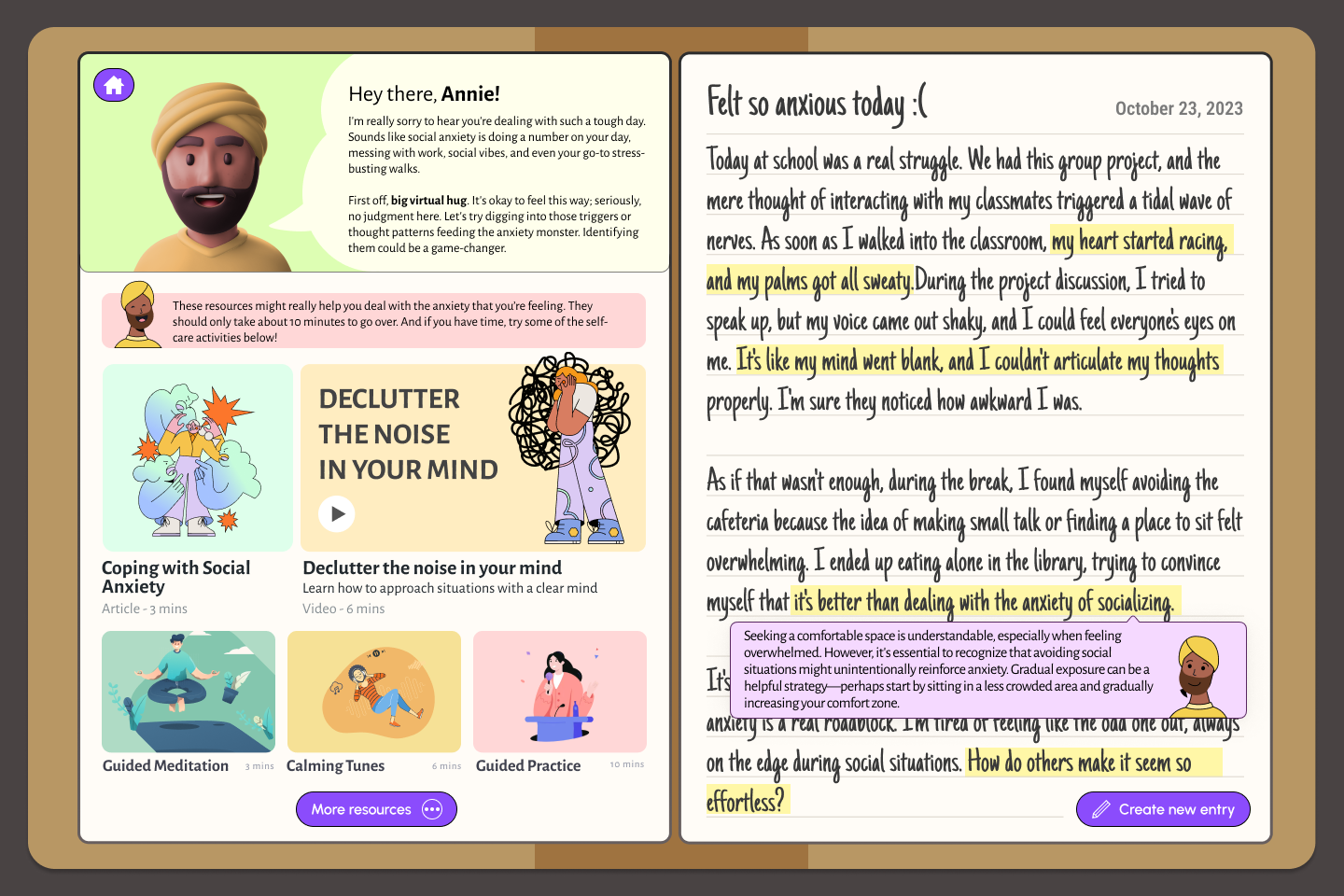
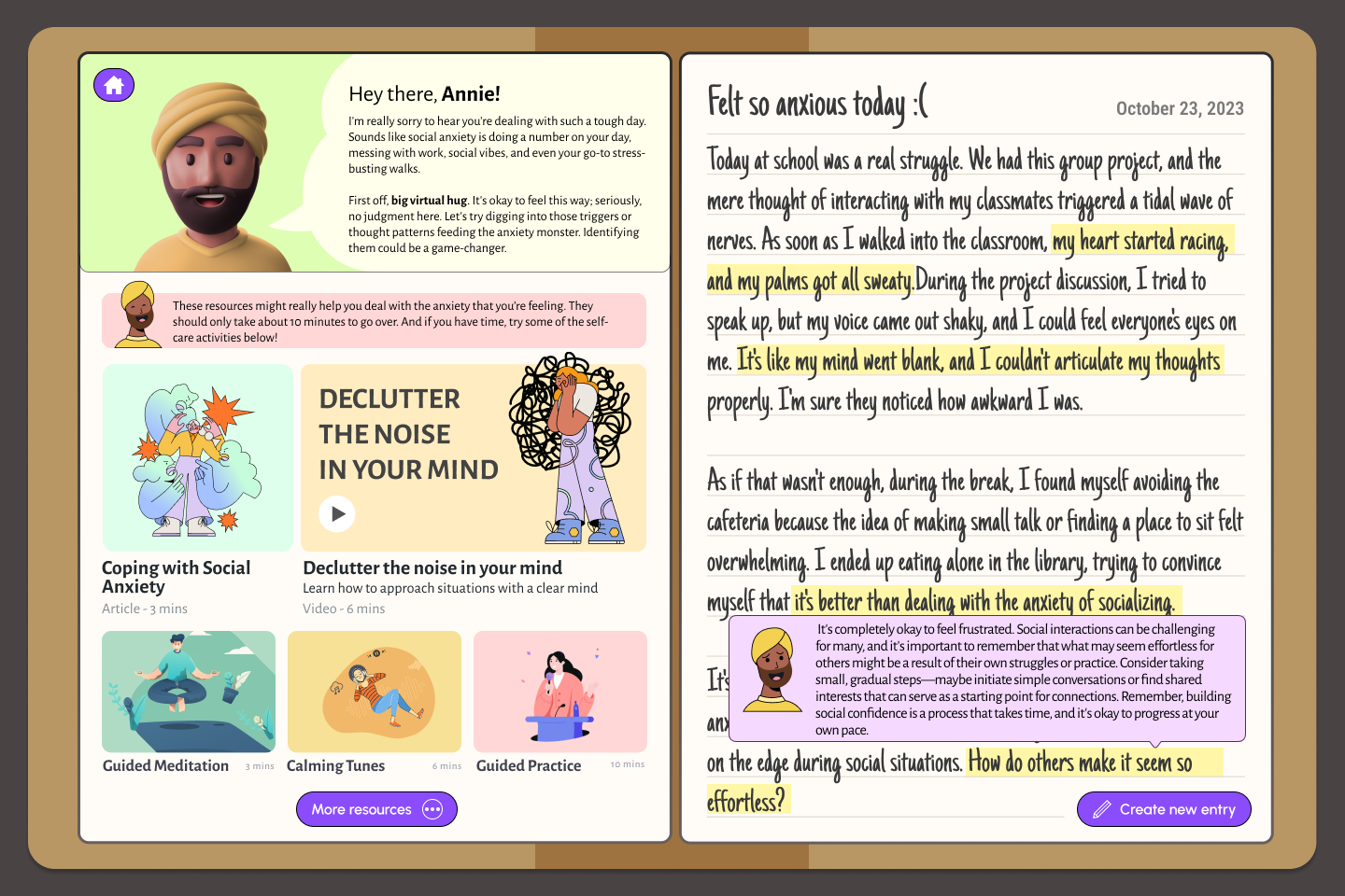
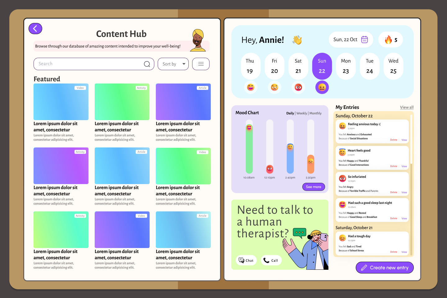
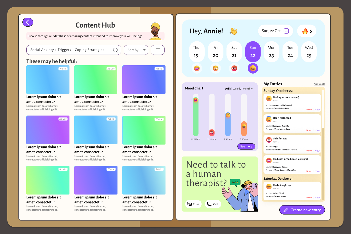
The last part of the project involved adding more fidelity to my designs and creating a final playable prototype. I designed several pages that encompassed the entire journey a user might take before, during, and after writing in their entry. I developed a “3D” mockup (really just a 2D mockup playing with perspective and shadows) that included a fingerprint security feature, an avatar that speaks to the user and responds to specific parts of their entry, and an overall revised and more inviting interface.
The last part of the project involved adding more fidelity to my designs and creating a final playable prototype. I designed several pages that encompassed the entire journey a user might take before, during, and after writing in their entry. I developed a “3D” mockup (really just a 2D mockup playing with perspective and shadows) that included a fingerprint security feature, an avatar that speaks to the user and responds to specific parts of their entry, and an overall revised and more inviting interface.

Interactive Prototype:
