Details
Tufa
Designing a Cashback Platform for Social Impact
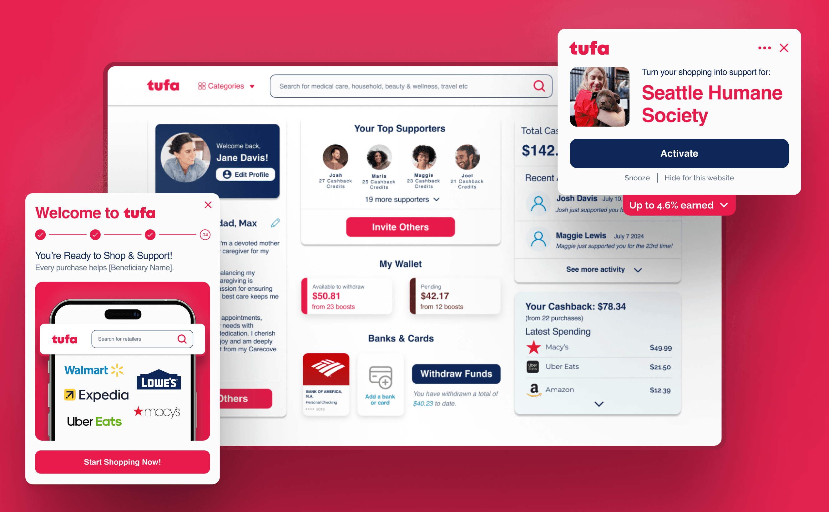
As the Founding Product Designer at Tufa, I led end-to-end design of a fintech product that reimagined cashback as a way to sustain care, support one another, and give with dignity. In this role, I shaped everything from early concepts and flows to visual design, a entire design system, and the shipped MVP. It was a role where I constantly switched between big-picture strategy and tiny interface details .
role
Founding Designer
duration
August–Dec 2025
areas
Product Strategy, UX/UI, Design Systems
Team
3 Founders, 4 Developers, 2 Designers
01 Background & Problem Framing
The Founder's Story
Tufa began with a deeply personal moment for our founder, Steve Lane. Several years ago, Steve was heading home from work when he was struck by a drunk driver while riding his scooter. He suffered a severe traumatic brain injury, and for a time his recovery was uncertain.
What ultimately carried him through were the people around him: his wife, his friends, and a community who showed up for him in ways big and small. But Steve also experienced how support naturally fades over time, even though caregiving needs don’t.
our core question
How might we make it easy for someone who wants to support a cause or someone they care about… to do so in a sustainable, ongoing way, without writing a check?
The Problem
Generosity isn't without inconvenience. People want to help but:
1
Support fades over time
2
Giving costs money
3
Helping takes effort
The Idea
"Earn cashback from your everyday purchases and automatically put it to work for the people and causes you care about — friends, family, or a cause close to your heart — all at no cost to you

Why "tufa"
Tufa is a porous rock that forms from small layers of mineral deposits accumulating over time, each one thin and unremarkable on its own, but together building into something solid and lasting.
We loved the metaphor: small aactions, lasting impact

02 Research
I conducted 10 conversations to uncover what motivates people to give.
Research Insights
1
Convenience sparkles motivation
Most tools prioritize drills over dialogue. Learners crave confidence, not just correctness.
2
Transparency builds trust
Language isn't neutral. Many apps lack context around American systems, customs, or everyday norms, leaving learners unprepared.
3
Community drives consistency
People keep showing up when they feel part of something collective.
Translating Insights into Product Experience
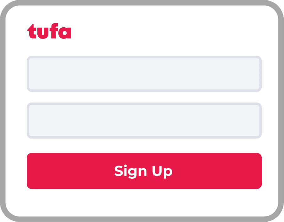
Onboarding
Where users first find motivation and understand what Circles are.
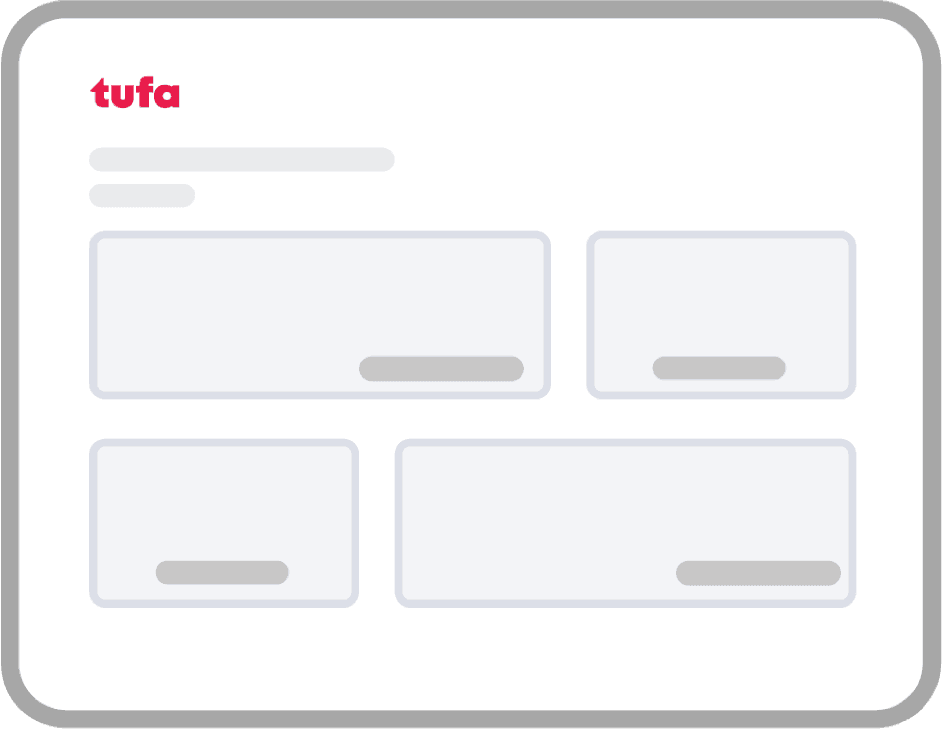
The Portal
Which builds trust by showing progress and transparency.
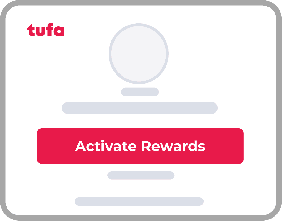
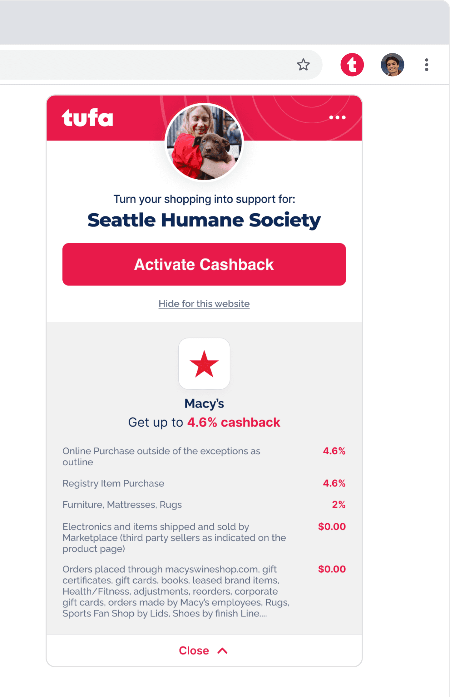
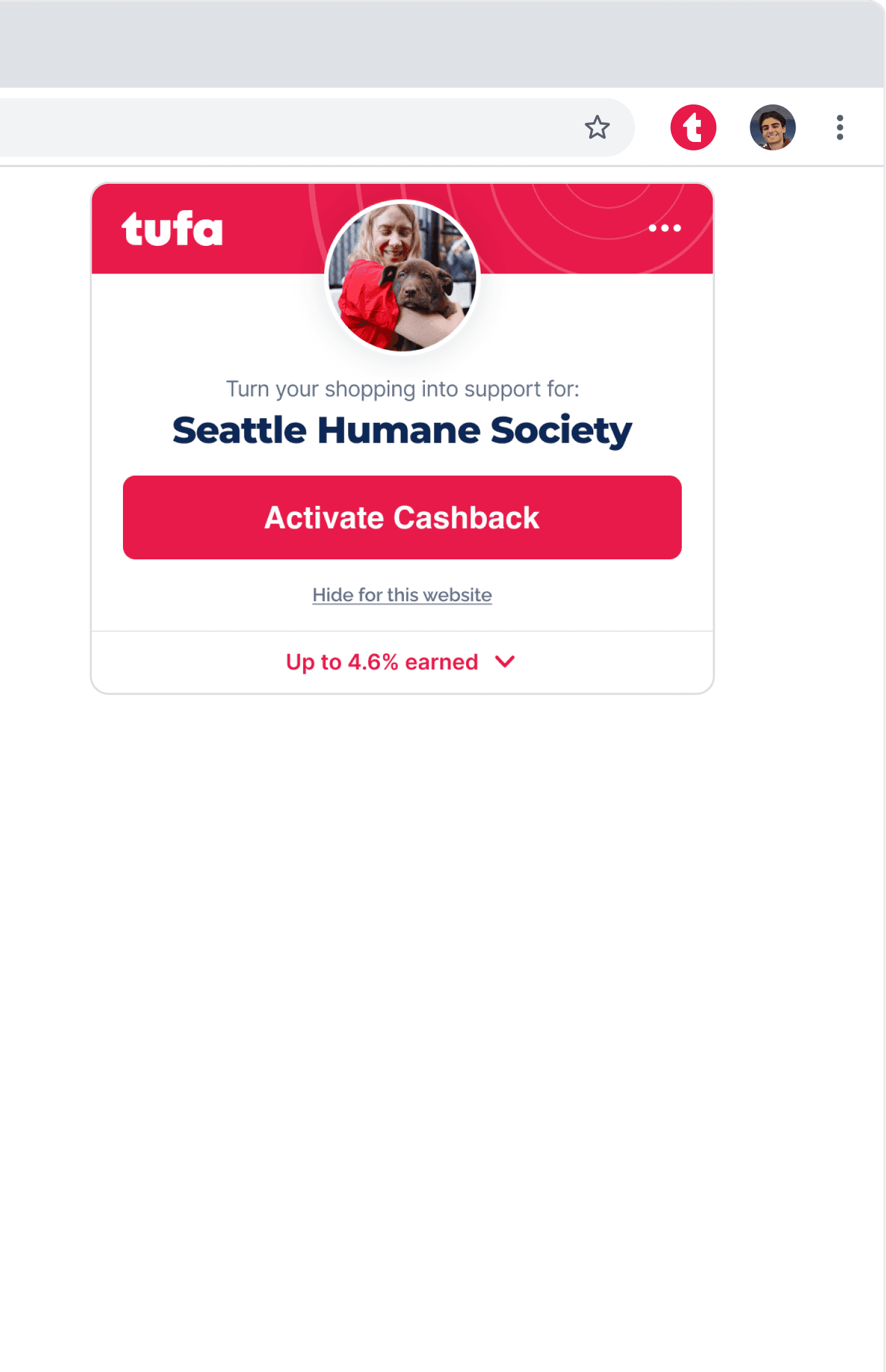
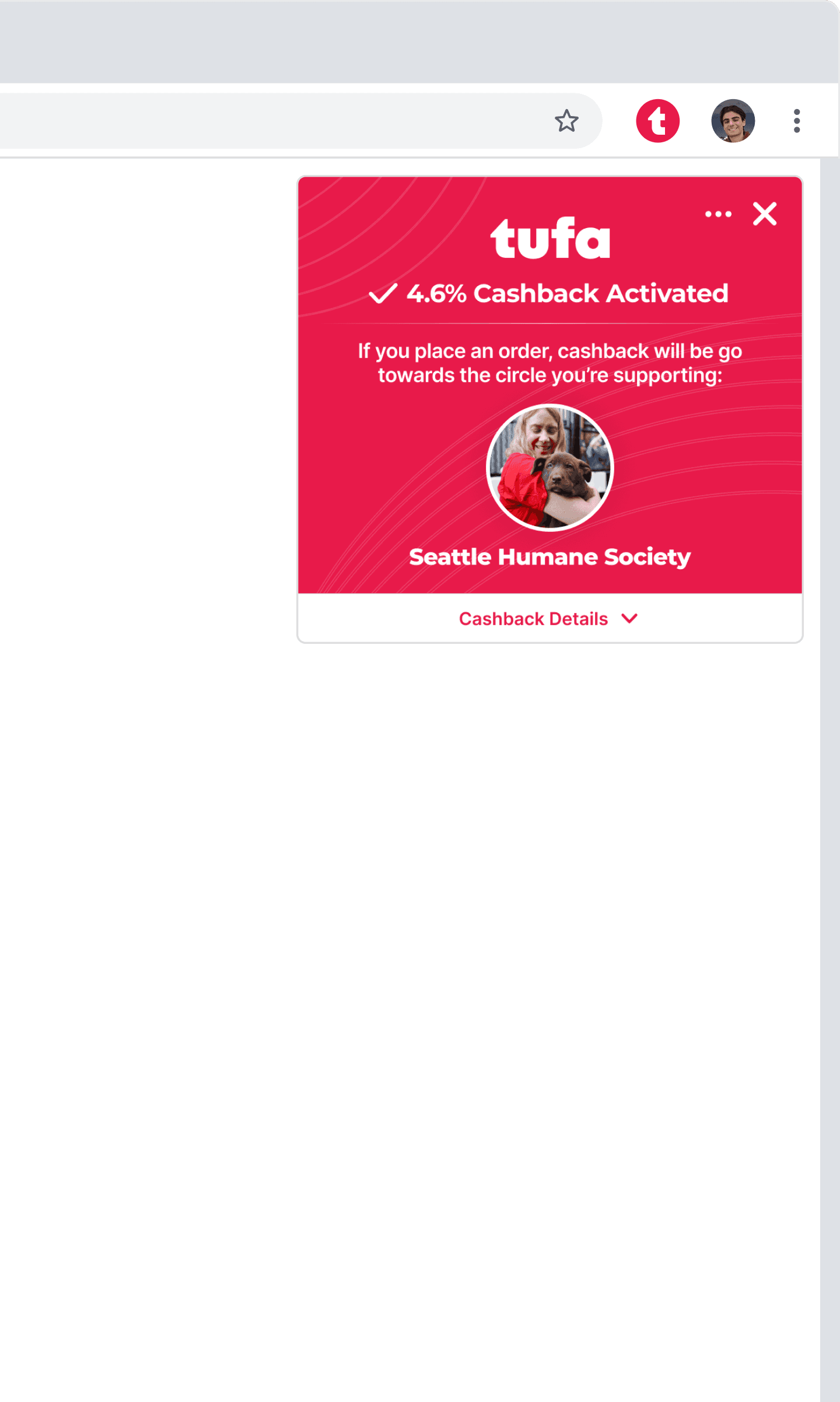
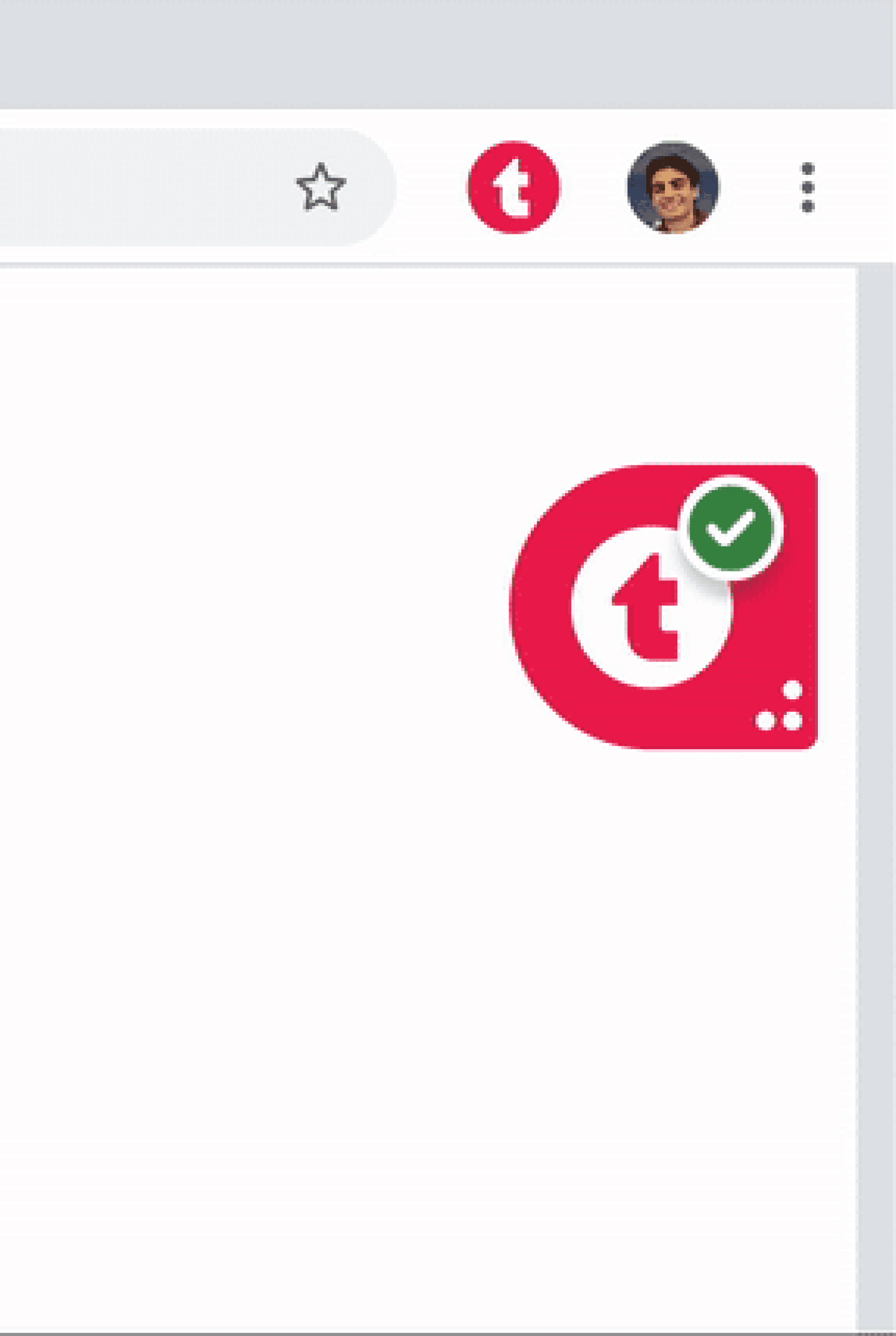
The Extension
Which creates convenience, keeping support going automatically.
03 Onboarding: The Motivation
Sign Up Flows
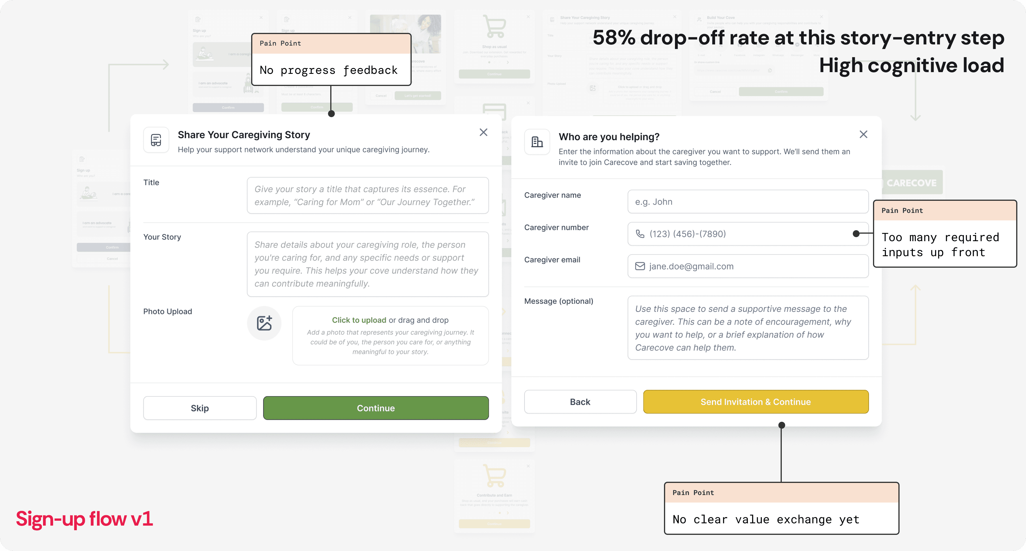
The first thing I worked on was the sign-up flow, back when Tufa was still focused on caregivers. Users identified as either a Caregiver or an Advocate — someone supporting a caregiver — then shared their story or who they were helping.
Visually, I explored two themes: soft green for caregivers, warm yellow for advocates. The design system was still evolving, so I was defining patterns on the fly.
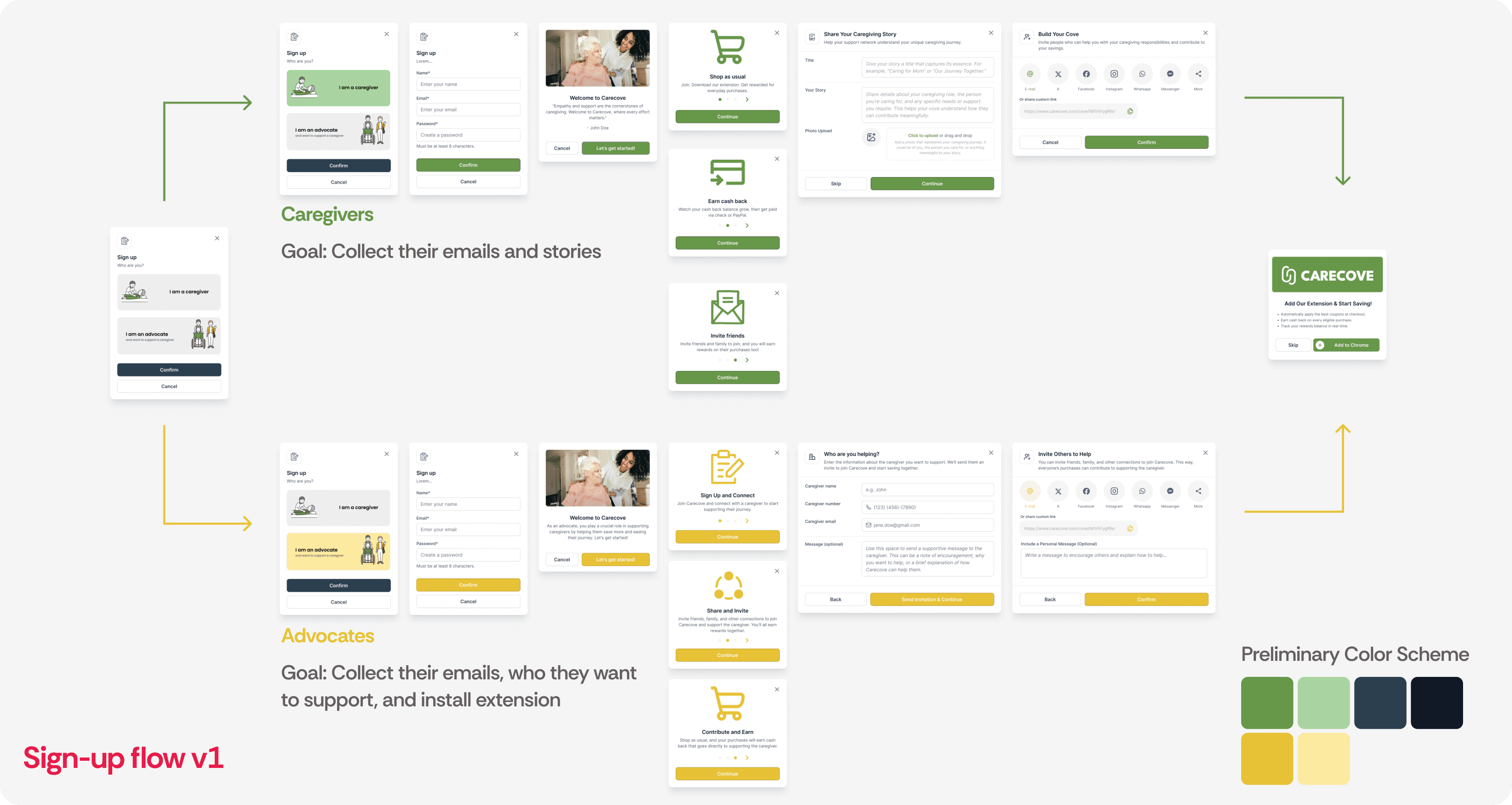
But the problem wasn't the visuals — it was the flow itself. We saw about a 58% drop-off at the story-entry step, driven by no progress feedback, too many required inputs up front, and an emotionally heavy question asked too early — all before users saw any clear value exchange.
From a UX perspective, this created high cognitive load: people had to do too much before understanding what they'd get in return.
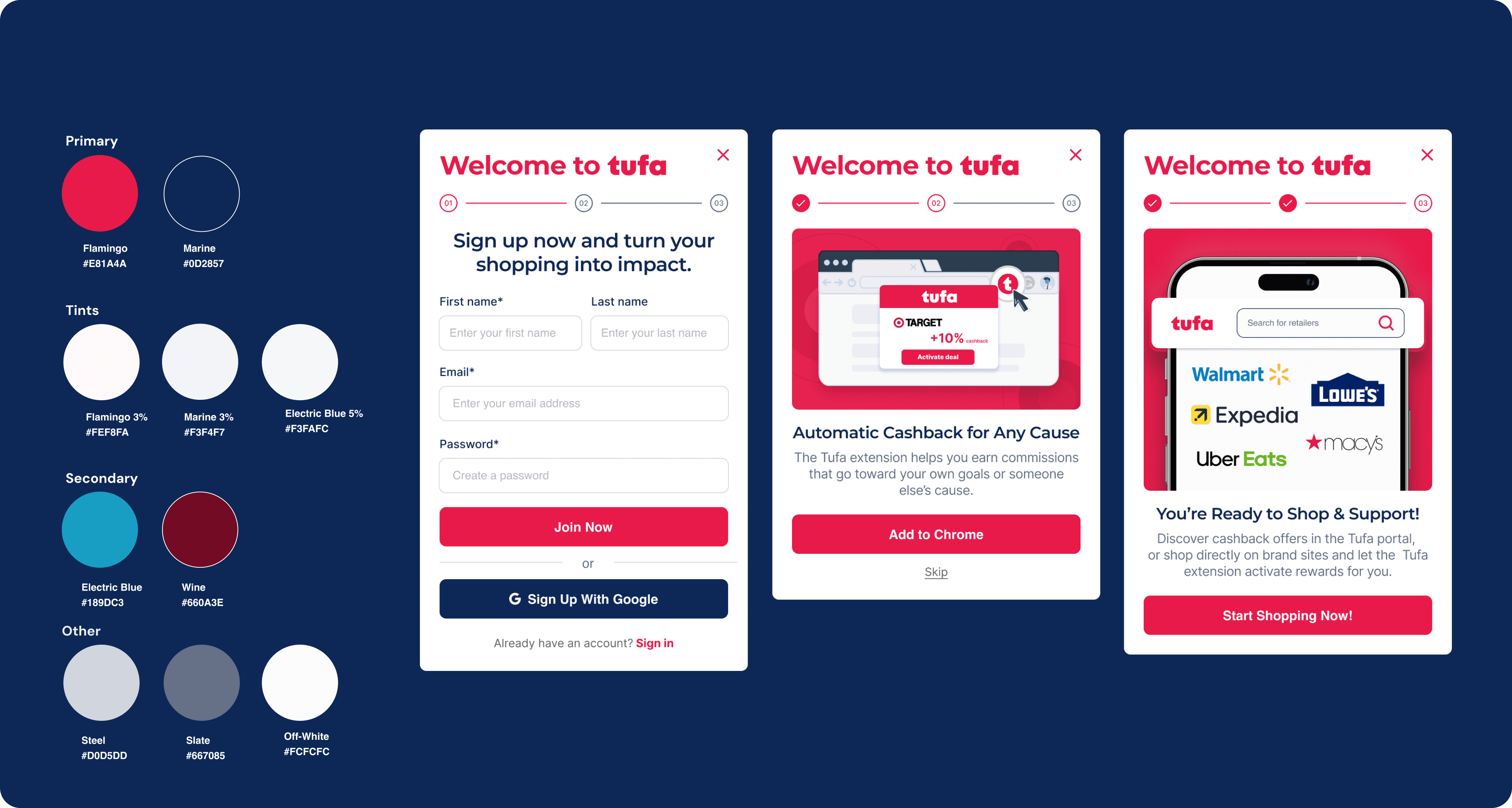
After seeing the high drop-off in the original version, I simplified onboarding into a three-step flow: sign up, optionally add the Chrome extension, and start shopping.
Around this time, our brand designer and I were formalizing the identity, which is when I started formalizing components and applying them to real product flows
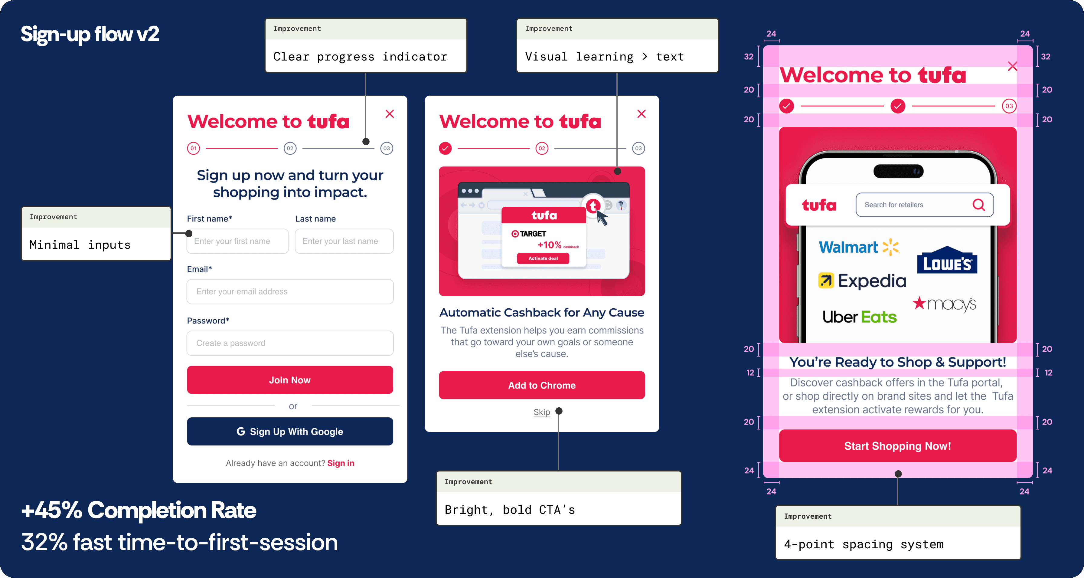
In the final version, only the first step had text inputs — the rest focused on momentum and quick action, using visual imagery over long text so users could instantly grasp how it worked.
The new flow drove a 45% higher completion rate and 32% faster time-to-first-session (via Google Analytics), and it's where the visual foundation came together — primary colors, bold CTAs, and a rule-of-4s spacing system, with every margin and padding scaled in 4-pixel increments.
Informational Modals
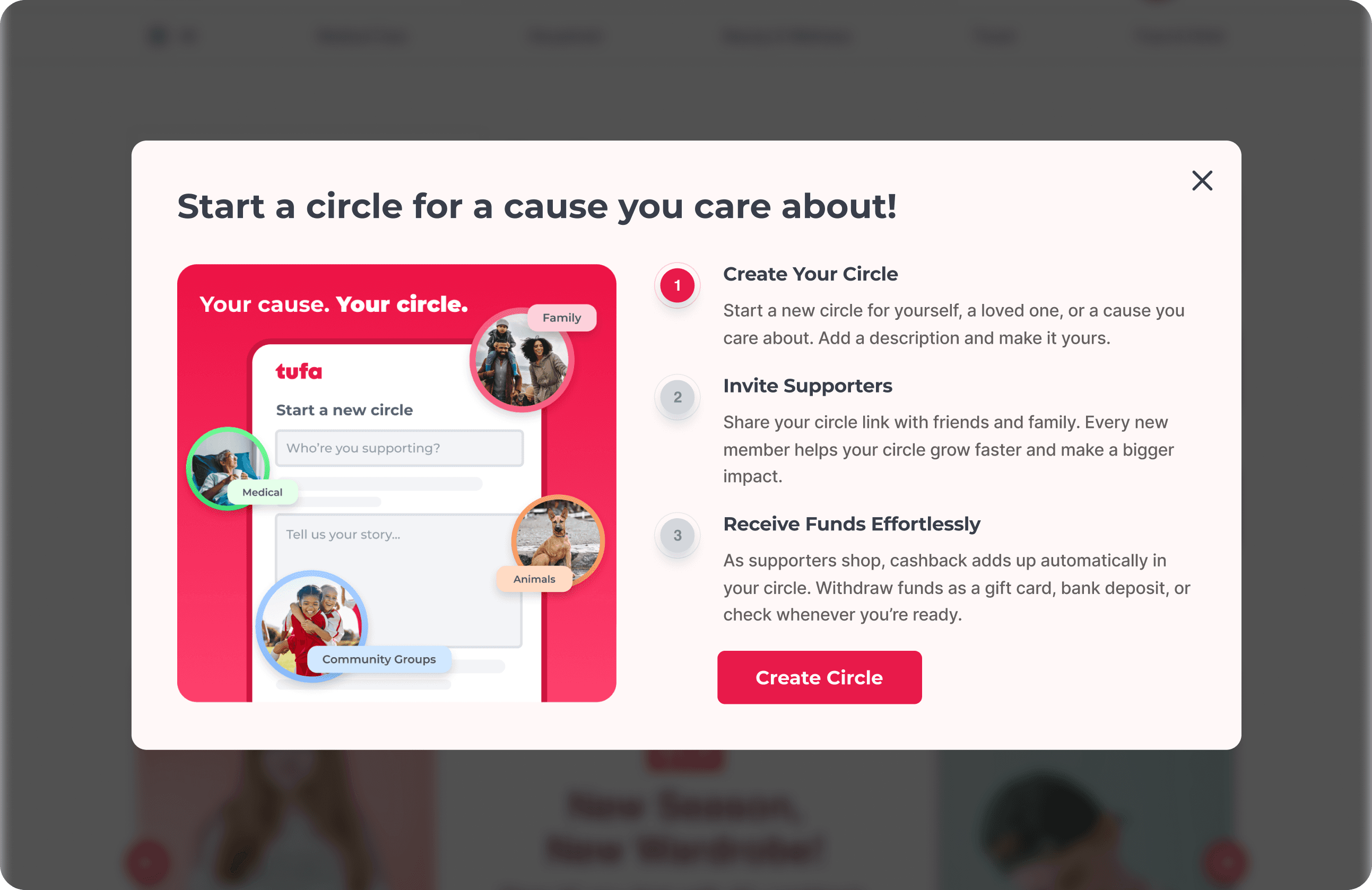
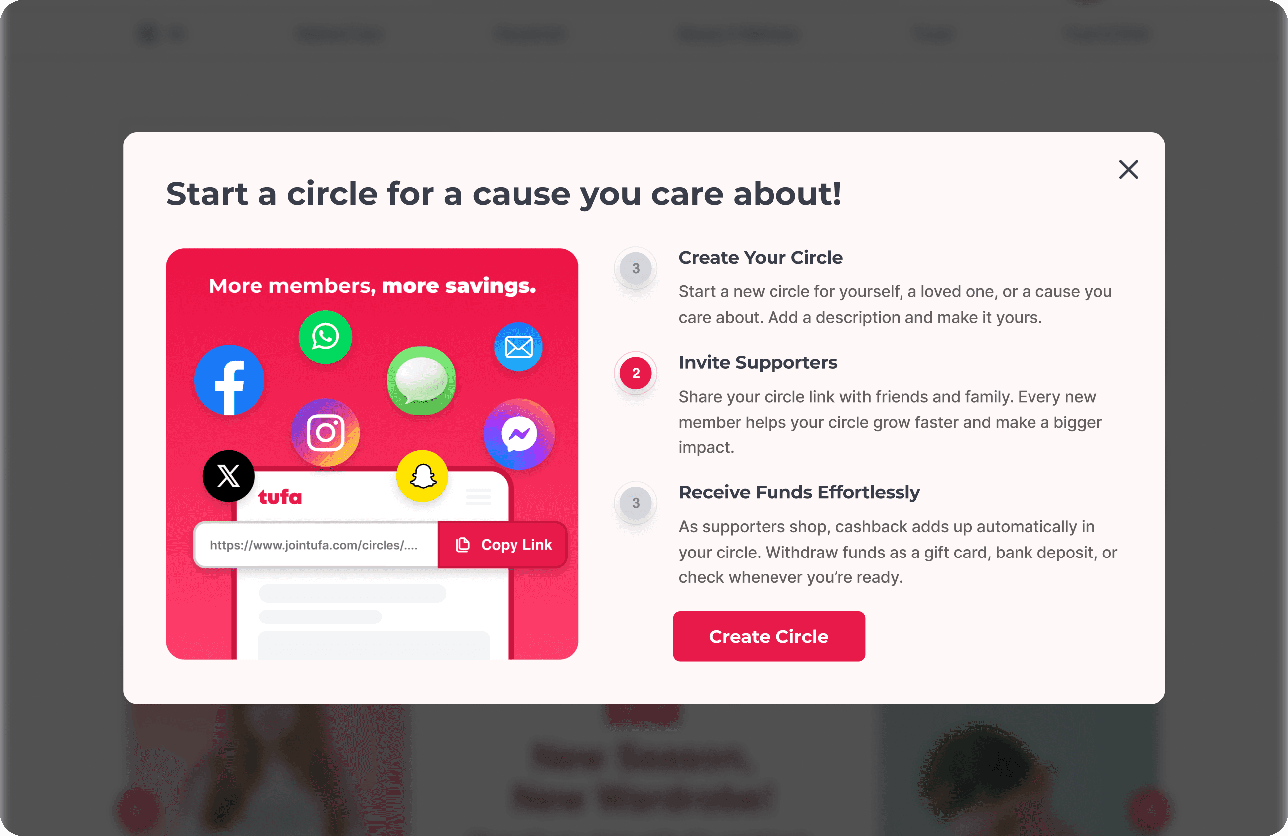
Visualizing value before action
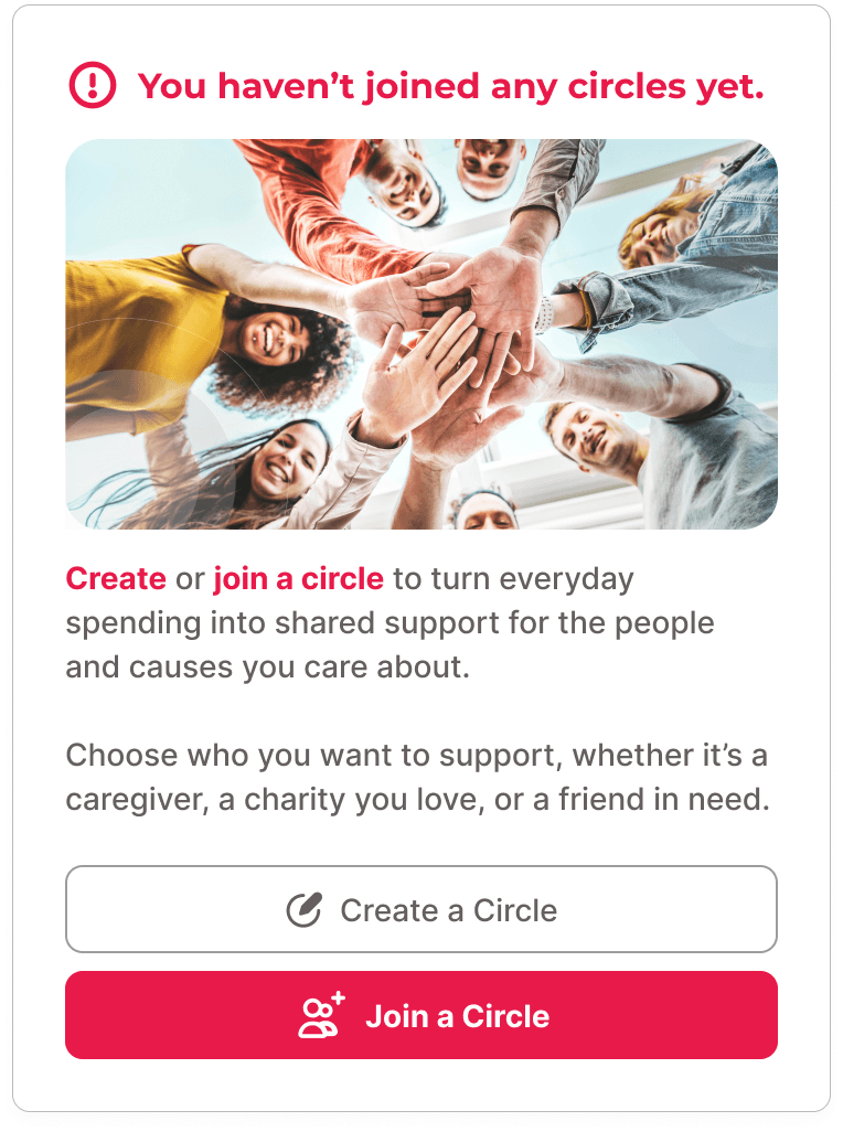
Once users finished onboarding and landed on the site, the next step was helping them take action — either creating a new Circle or joining one.
A Tufa Circle was the core of our product: a shared space where users could invite family or friends to contribute funds toward a goal.
Before dropping users into a form, I designed a short informational modal walking through the full journey.
Create a Circle Flow
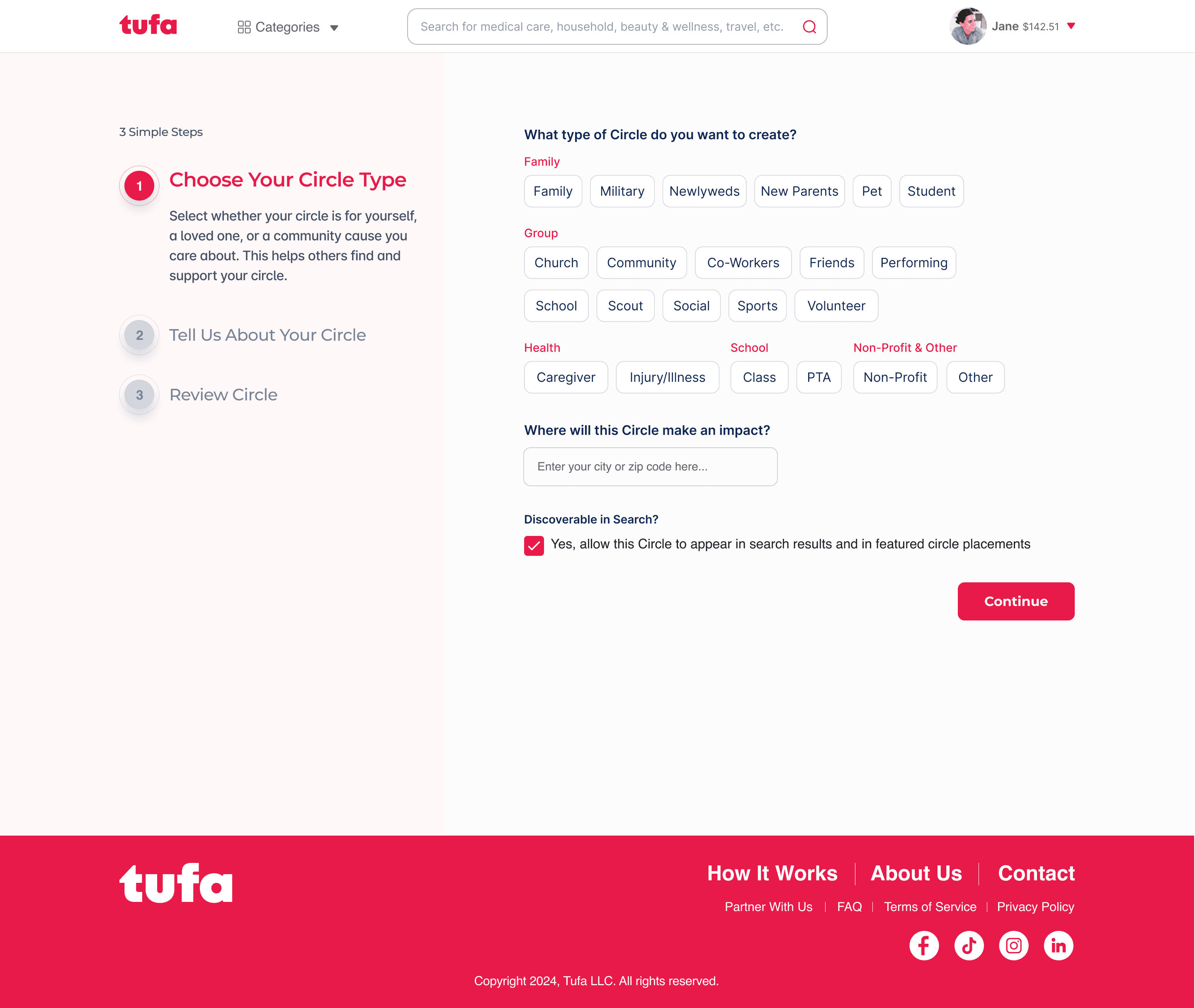
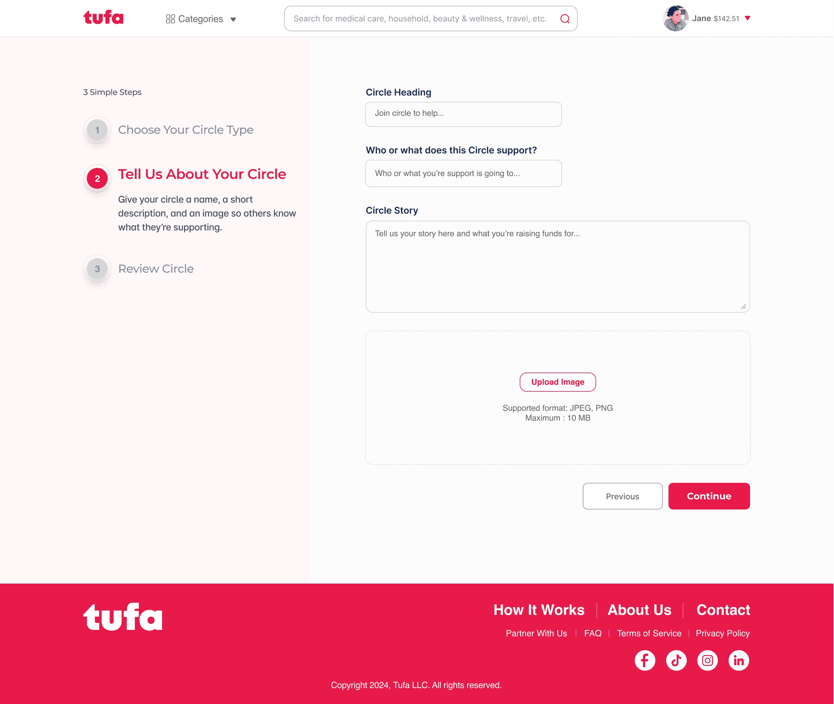
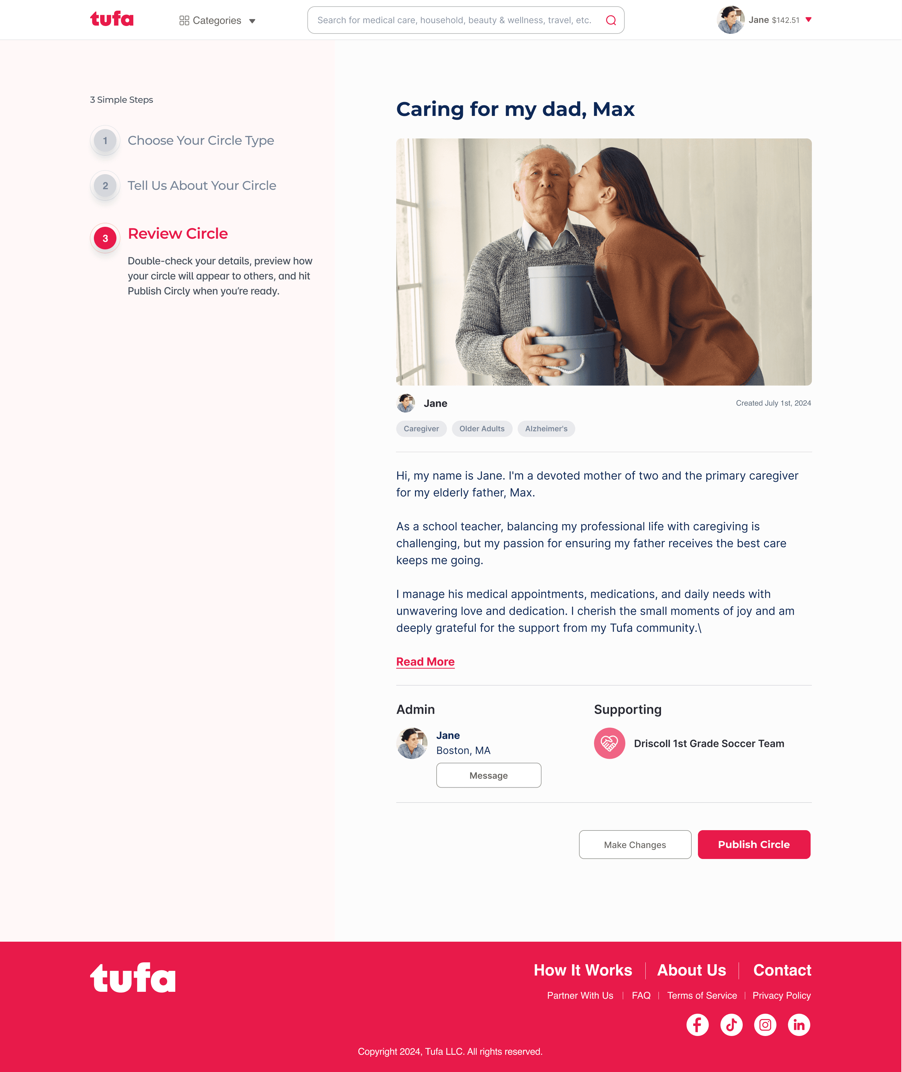
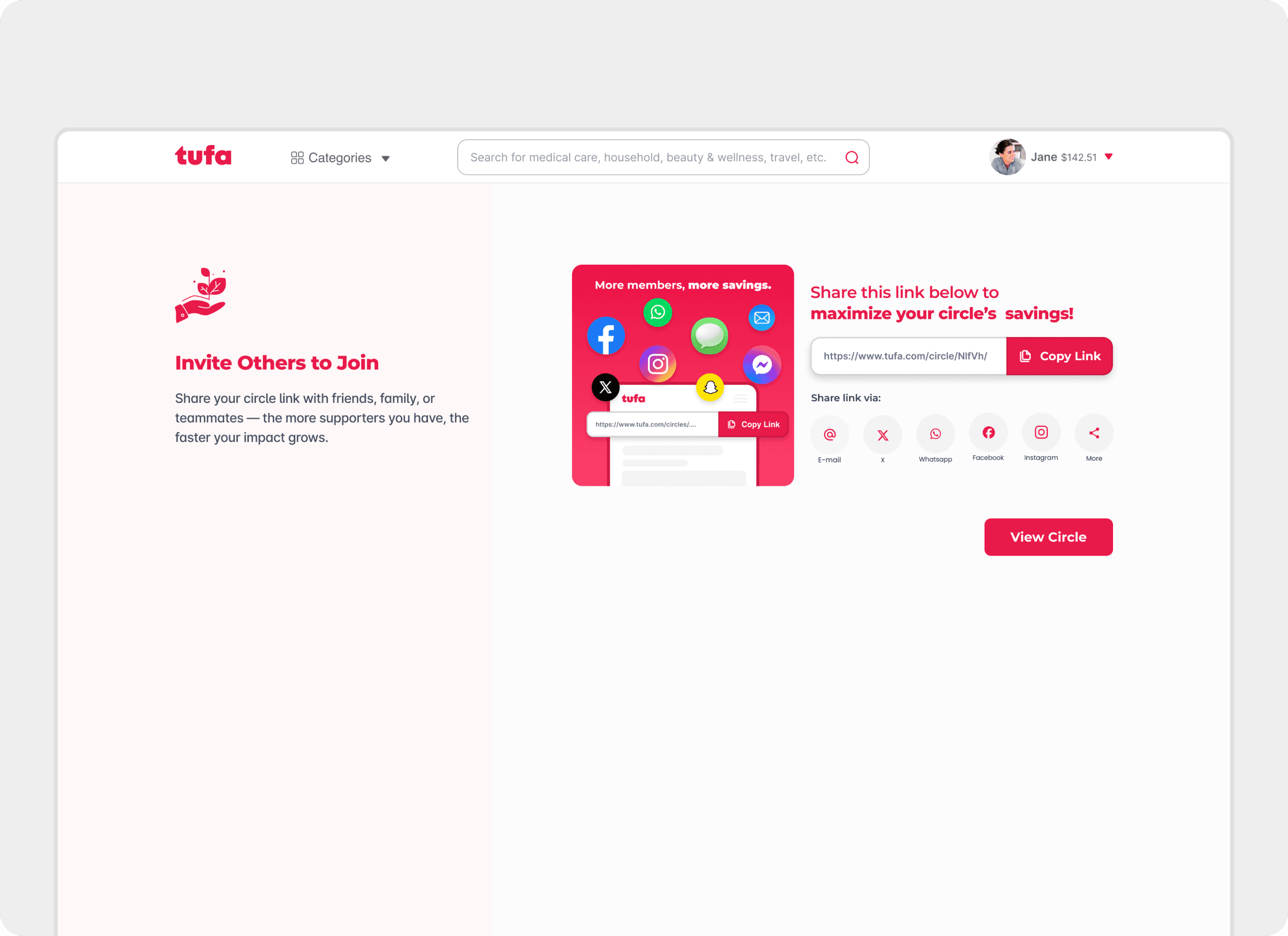
From there, users entered the Create a Circle flow — a clean, three-step process: choose the type of circle you're starting, tell us about it, and review before sharing.
Prioritized minimal forms, clear UI cues, a guided flow, and a friendly layout.

04 The Portal: Building Trust
Sign Up Flows
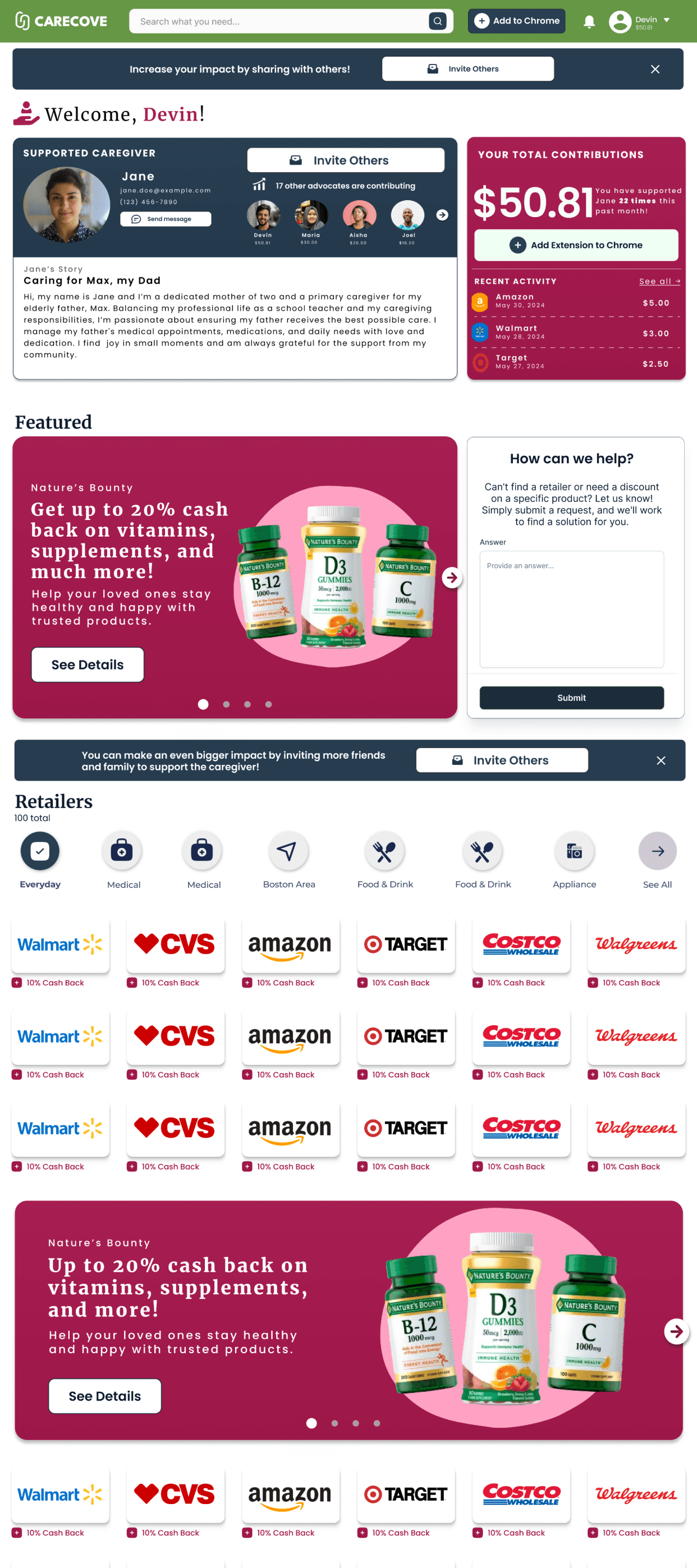
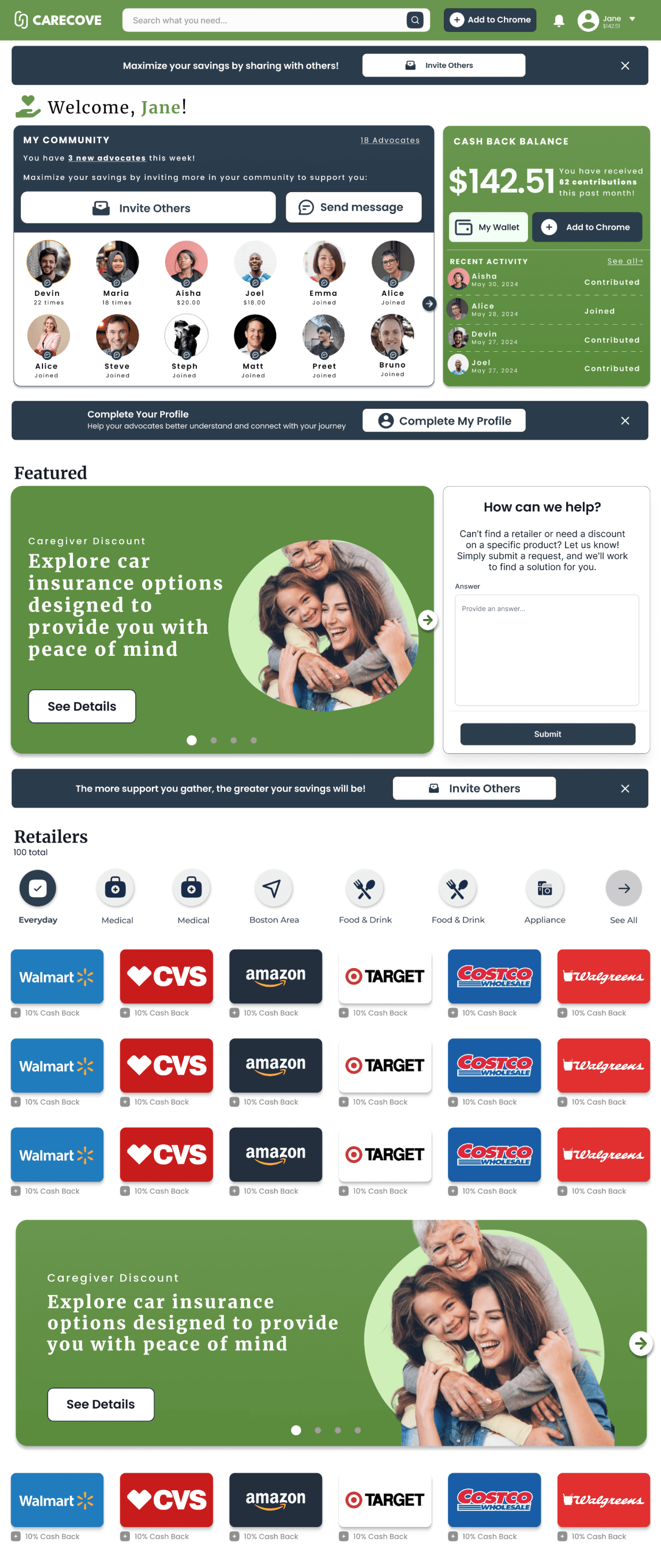
Early Wireframing:
Portal v1
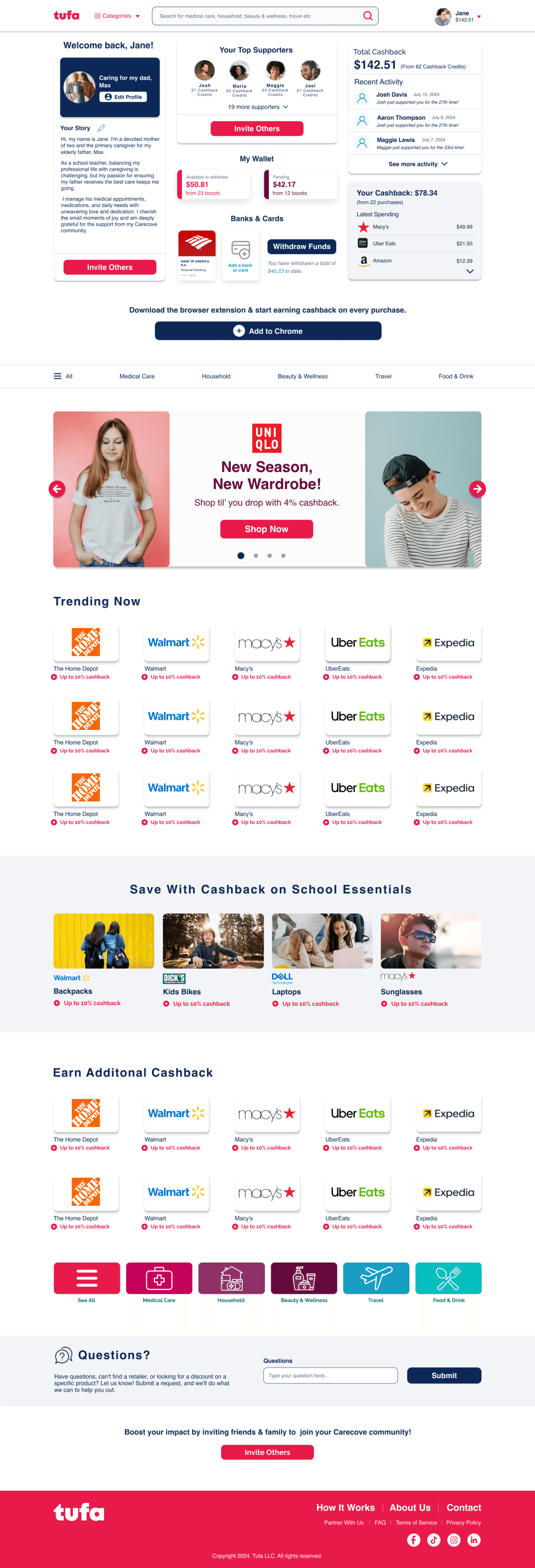
Portal v2
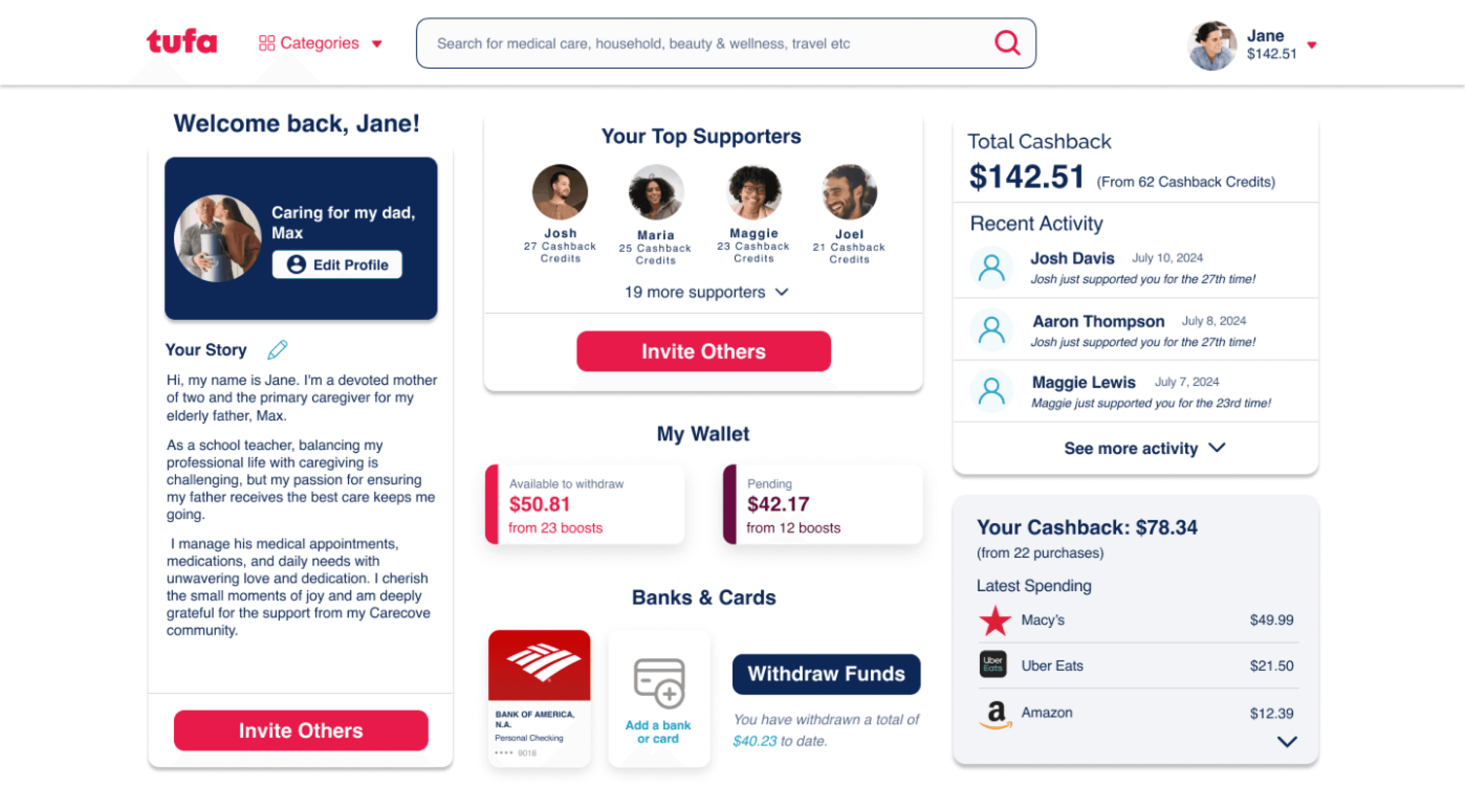
Pain Point
Inconsistent drop shadows
Pain Point
Poor padding
Pain Point
Inconsistent type hierarchy
Poor composition flow
Portal v2
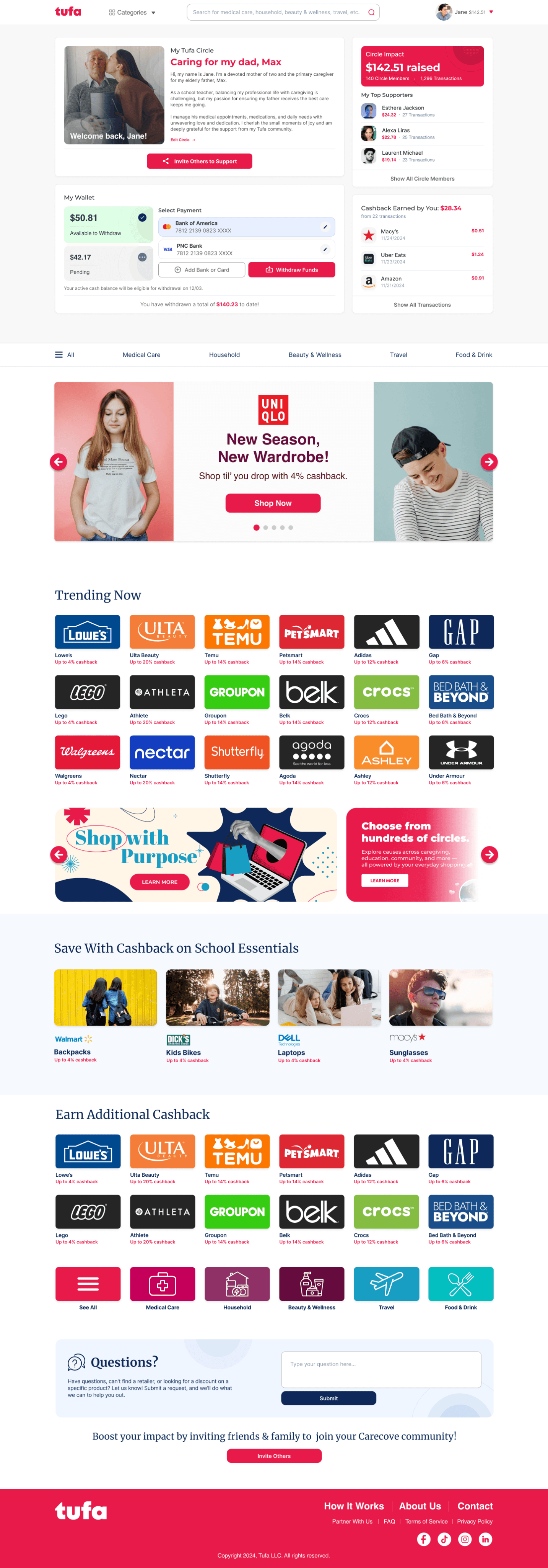
Portal v3
Preet Singh • 2024 • Klaviyo Portfolio Review
Case study 1
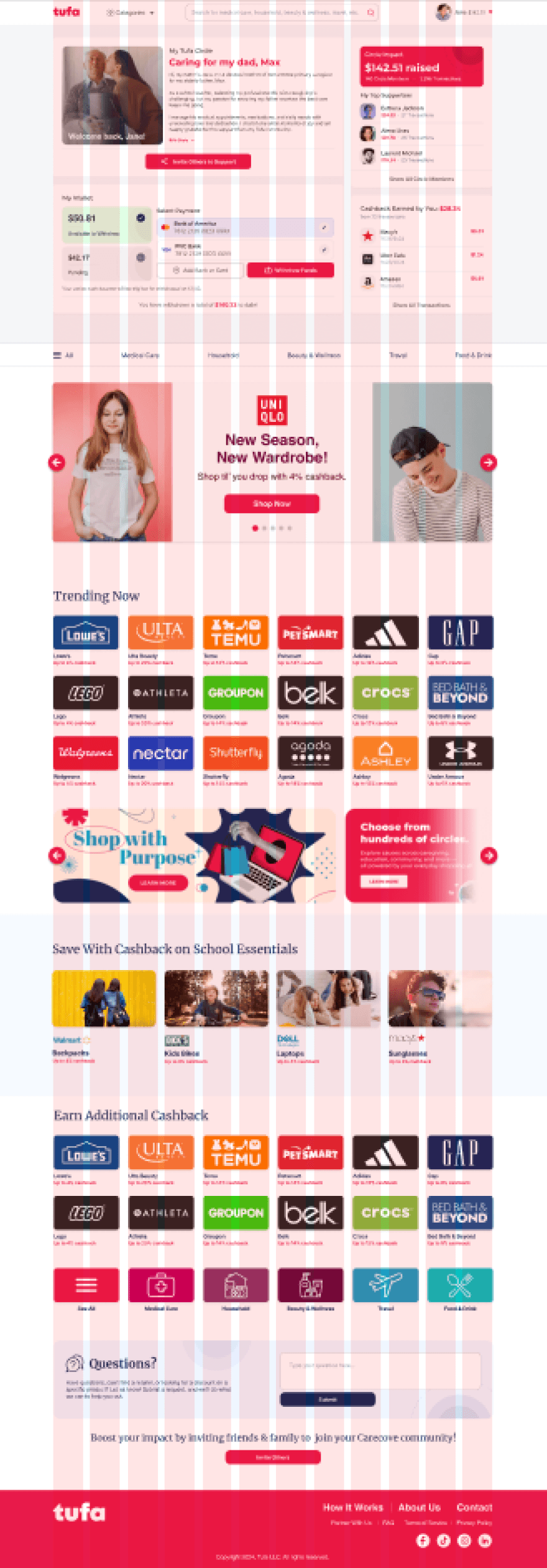
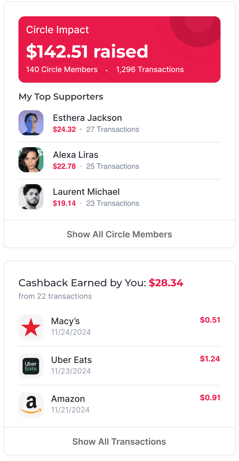
8px
corner radius
Concentric circles
Strong composition
12 column grid
Portal v3
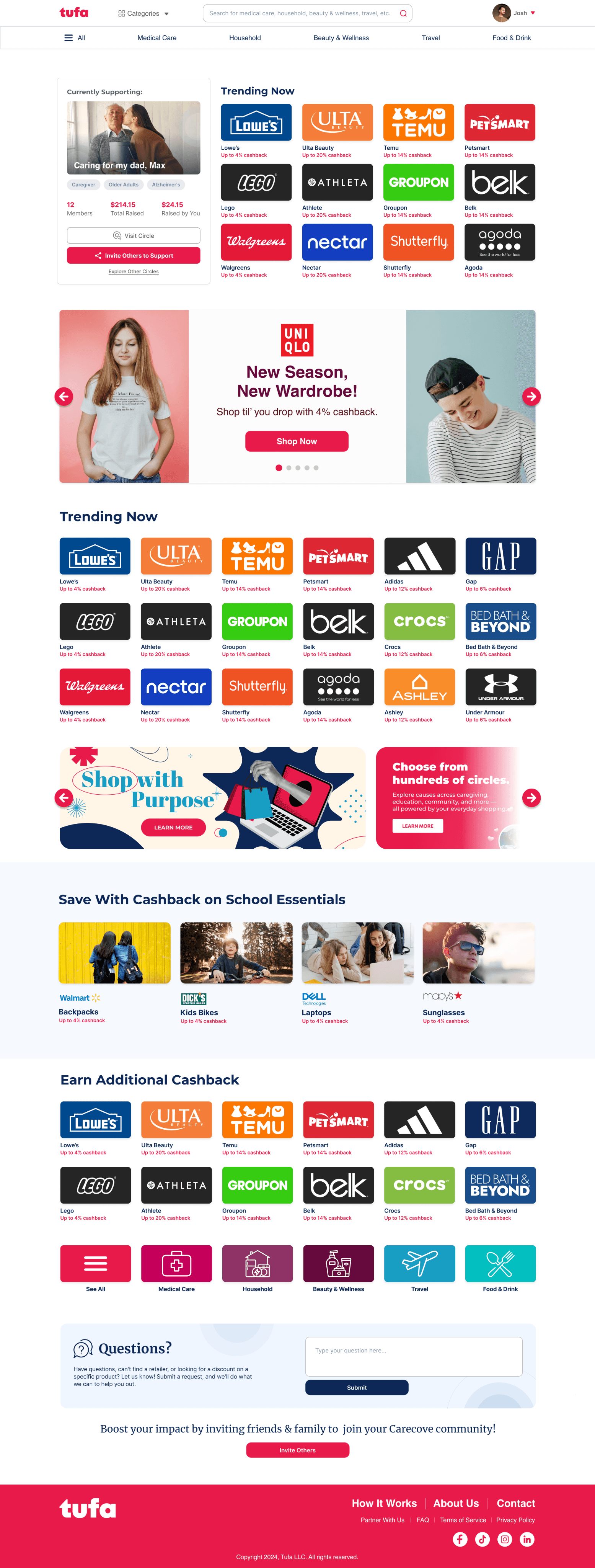
Portal v3:

Shop as usual and
activate your support.
+10% cashback

Activate deal
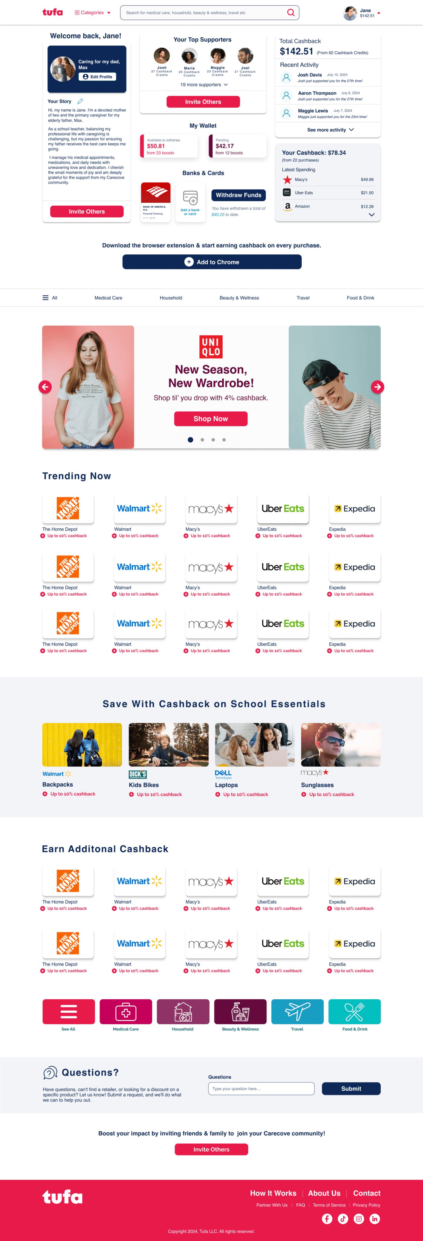
v2
Improvement
Brand colors as card backgrounds and softer shadows
Improvement
Custom banners for personality
Improvement
Tighter card spacing
Shop as usual and
activate your support.
+10% cashback
Activate deal
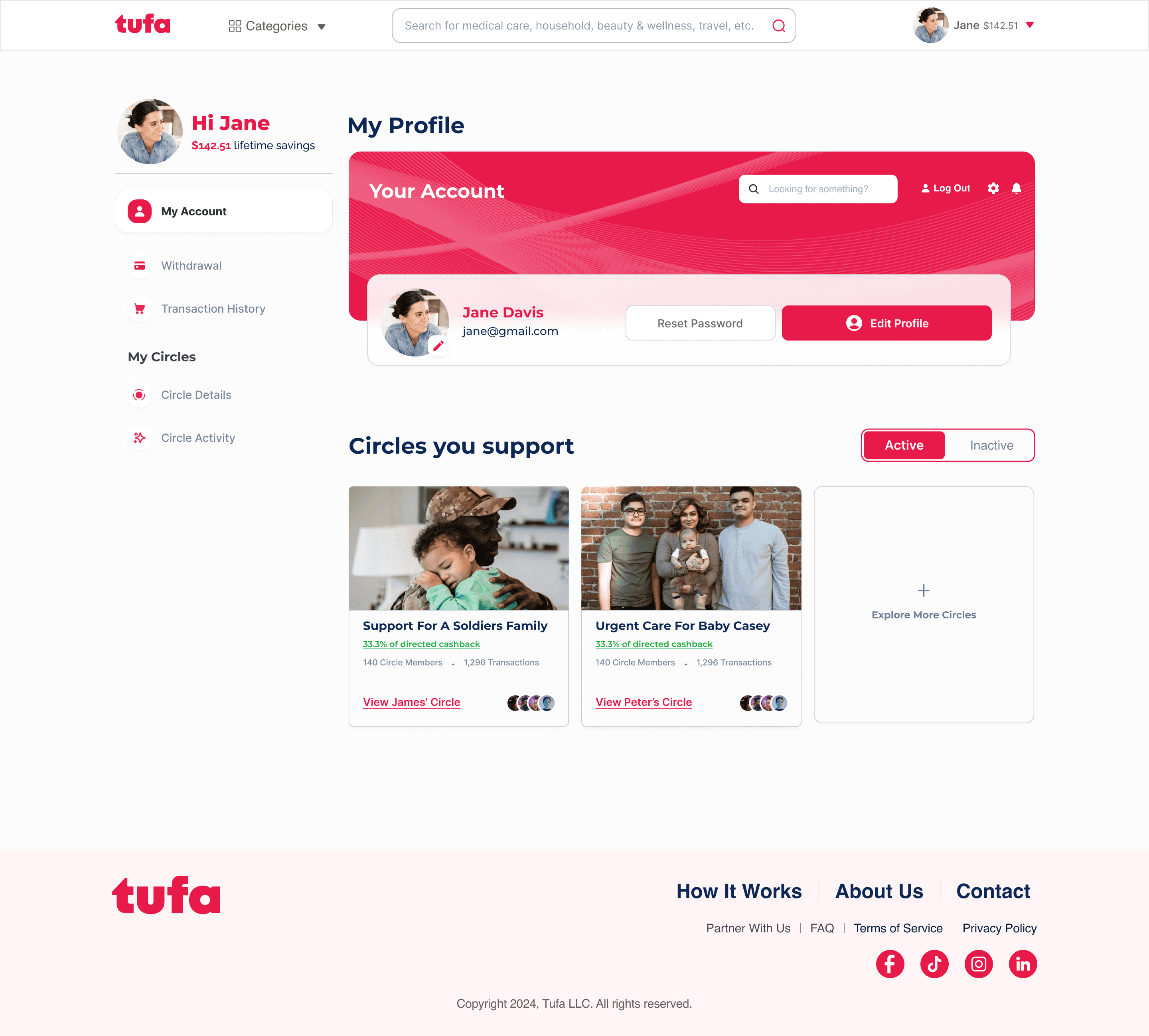
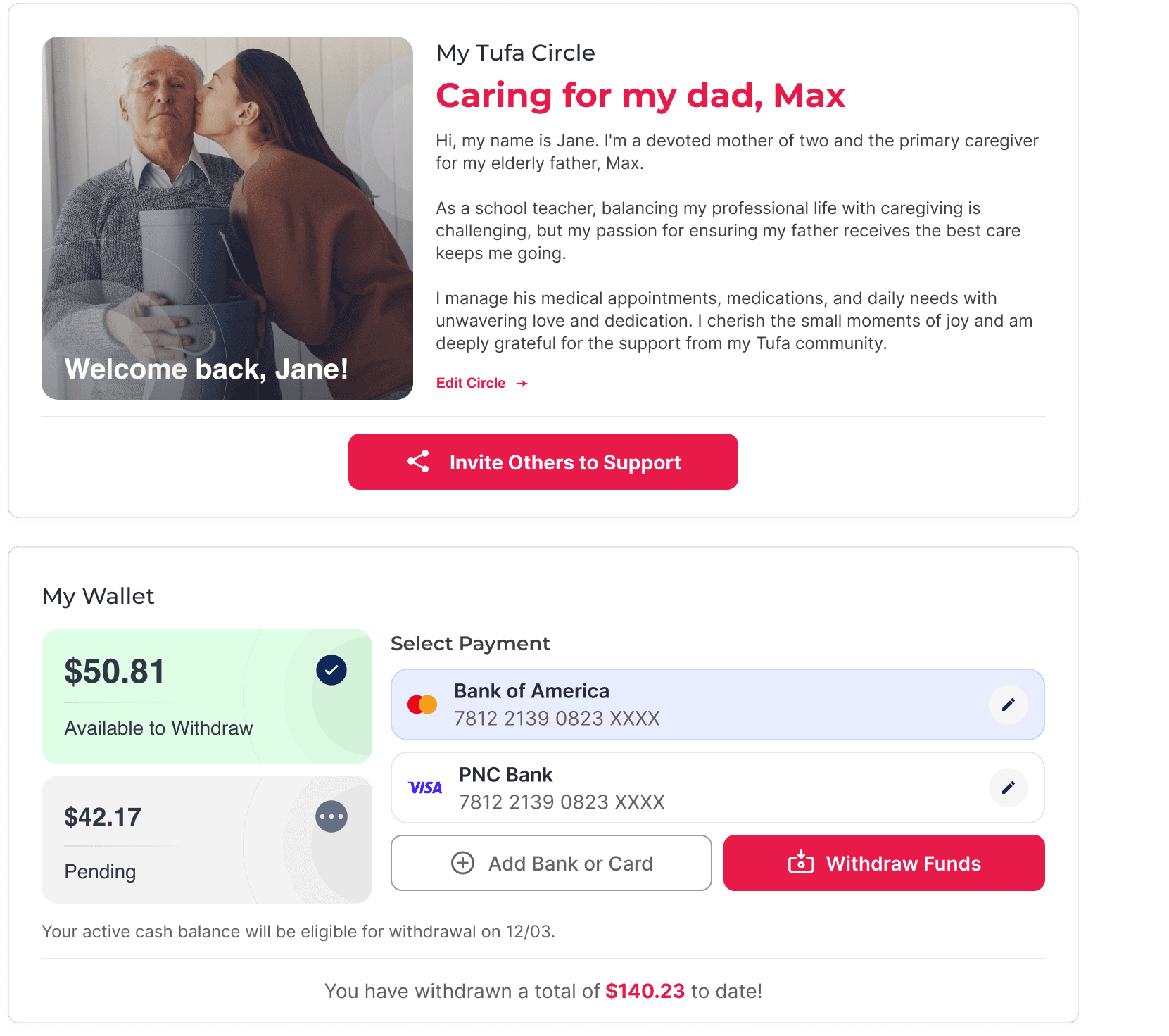
Account Page
Shop as usual and
activate your support.
+10% cashback
Activate deal
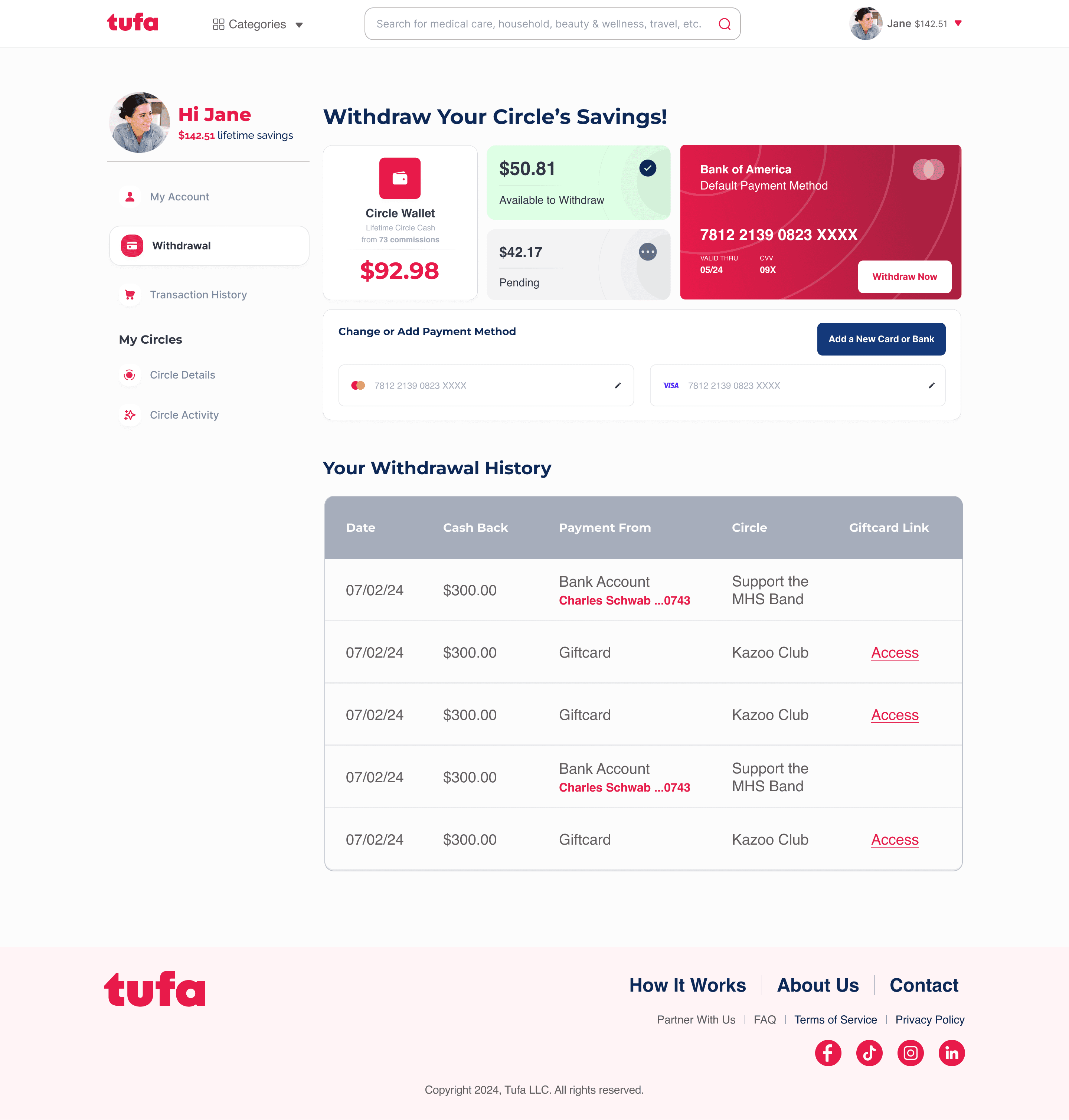
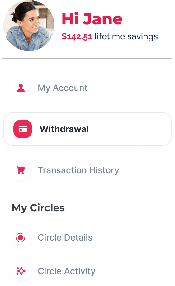
Withdrawal Page
Shop as usual and
activate your support.
+10% cashback
Activate deal
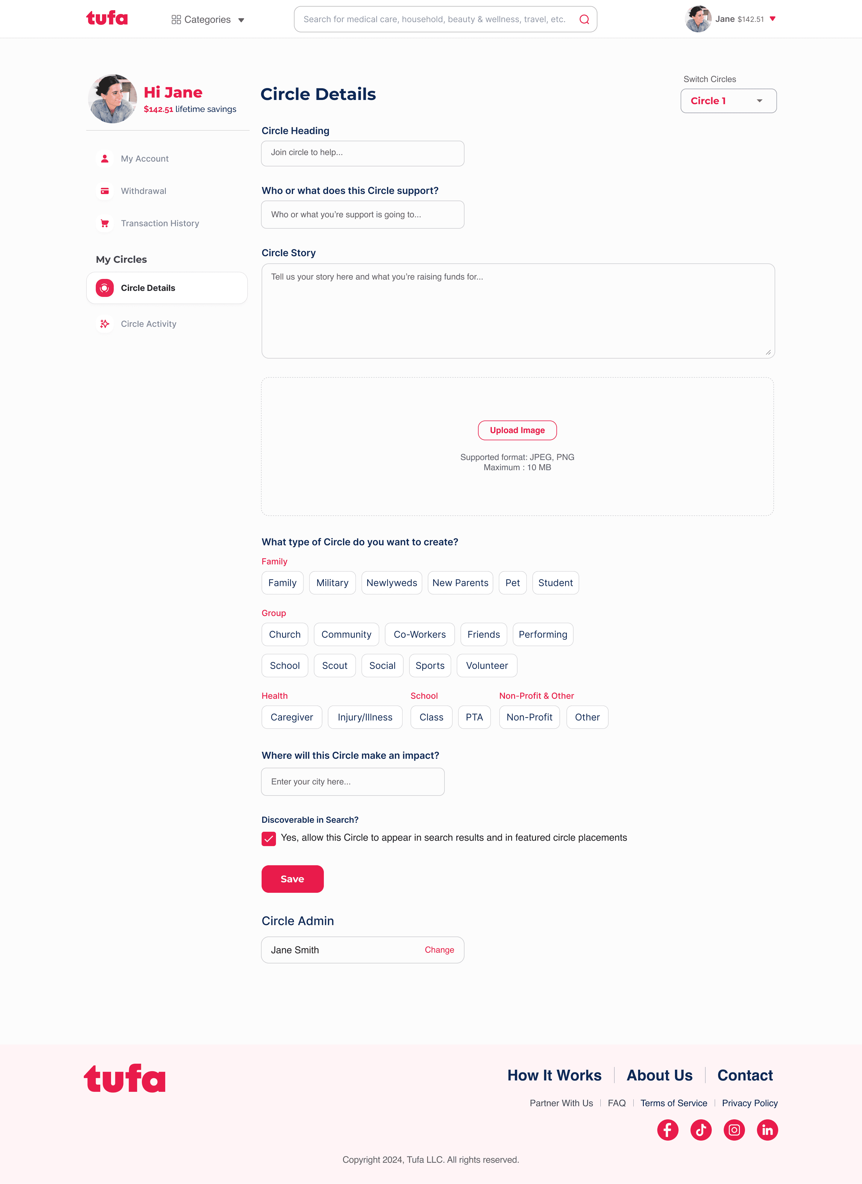
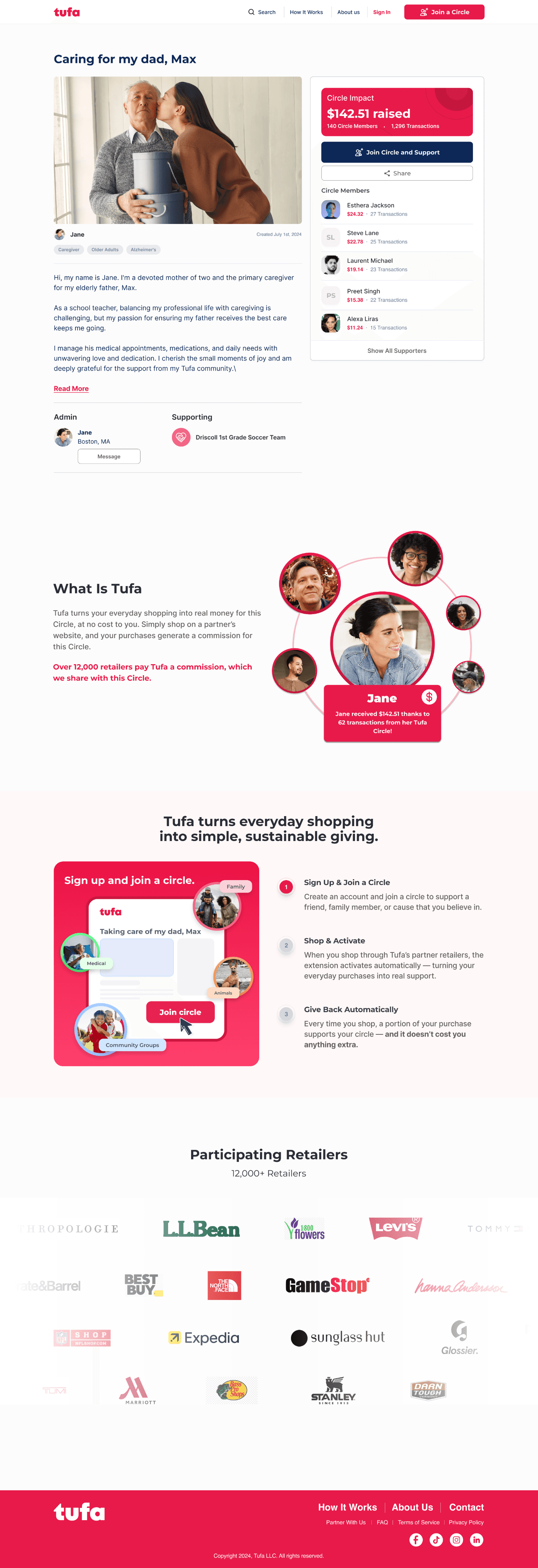
Circle Details Page
Shop as usual and
activate your support.
+10% cashback
Activate deal
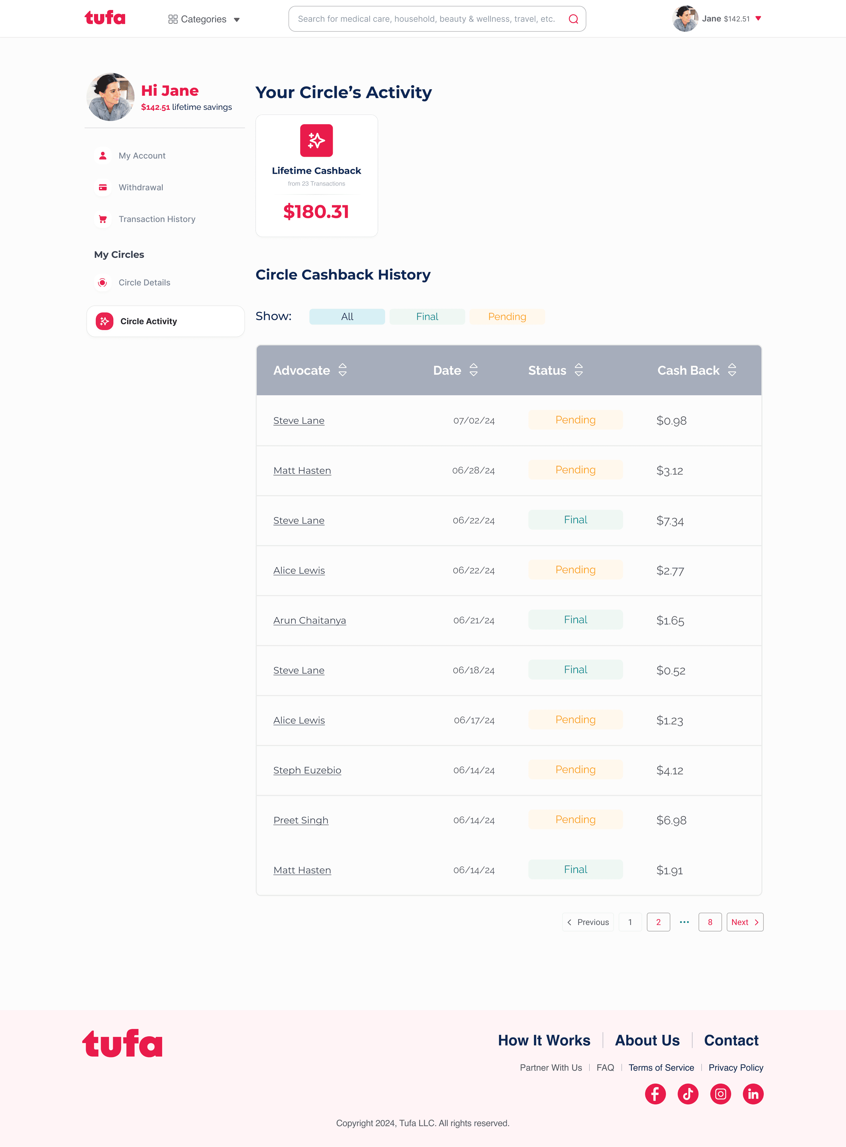
Circle Activity
05 The Extension: Creating Convenience
The Extension
Shop as usual and
activate your support.
+10% cashback
Activate deal
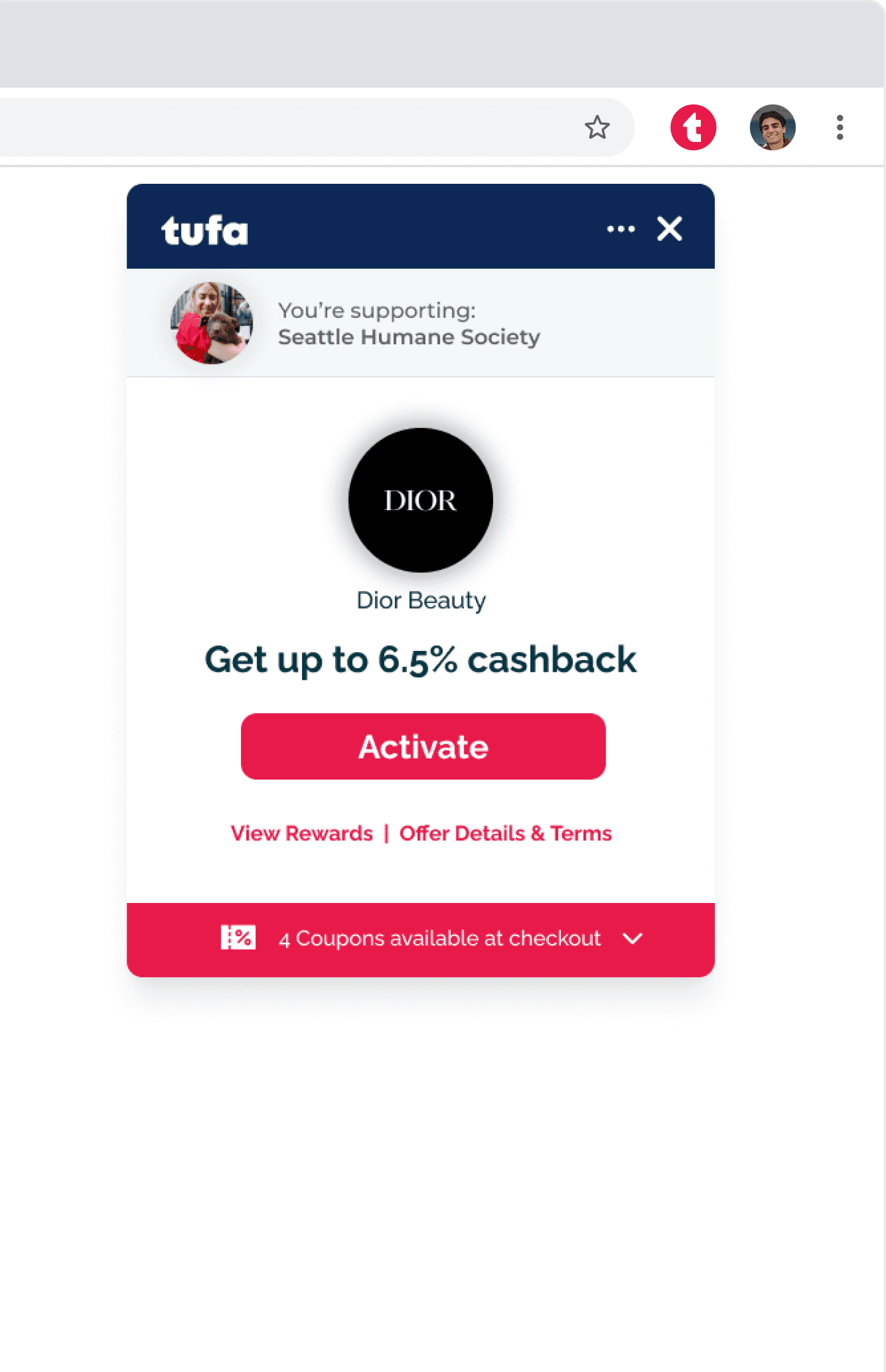
v1
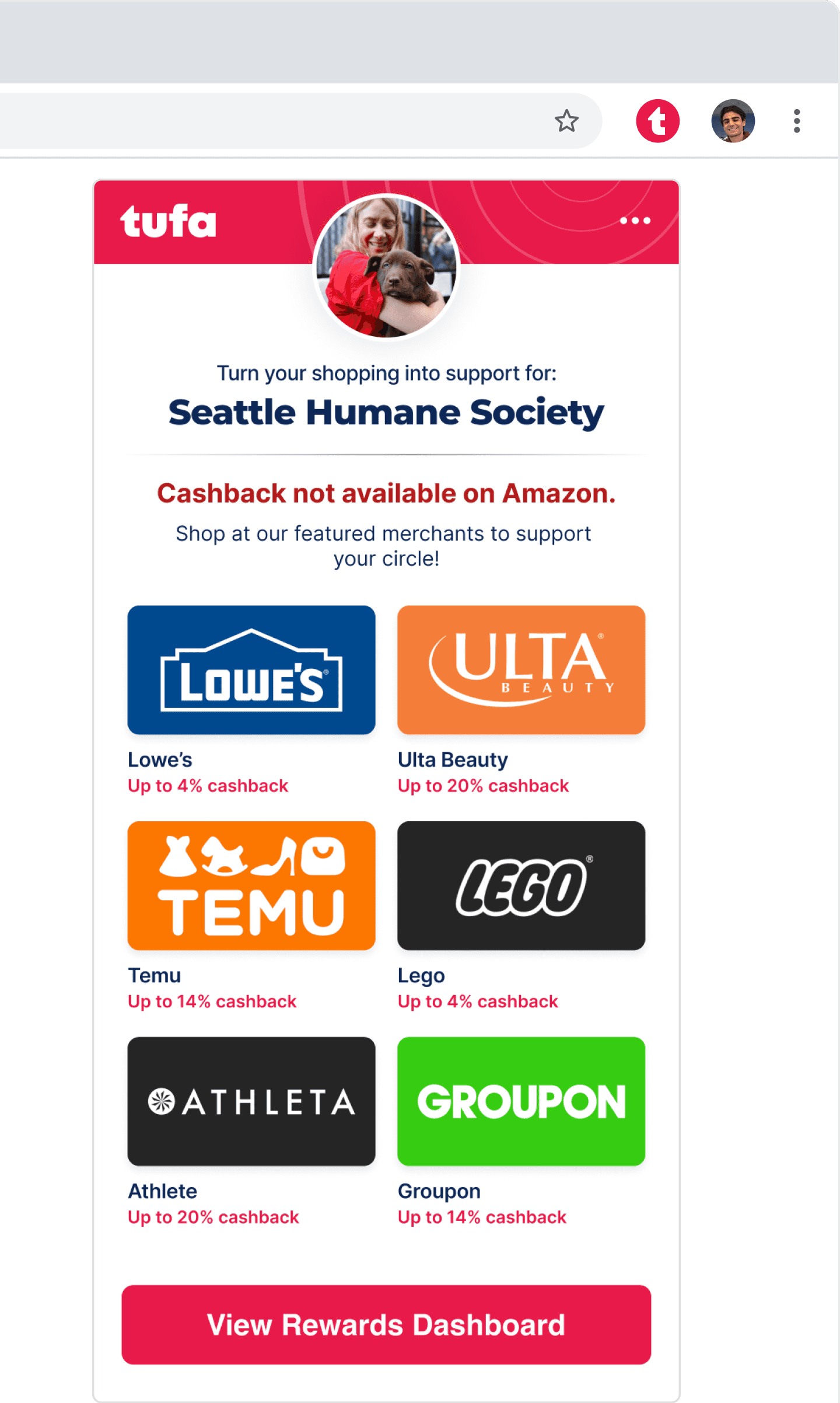
v2
Default
Expanded
Non-partner
24% increase in engagement

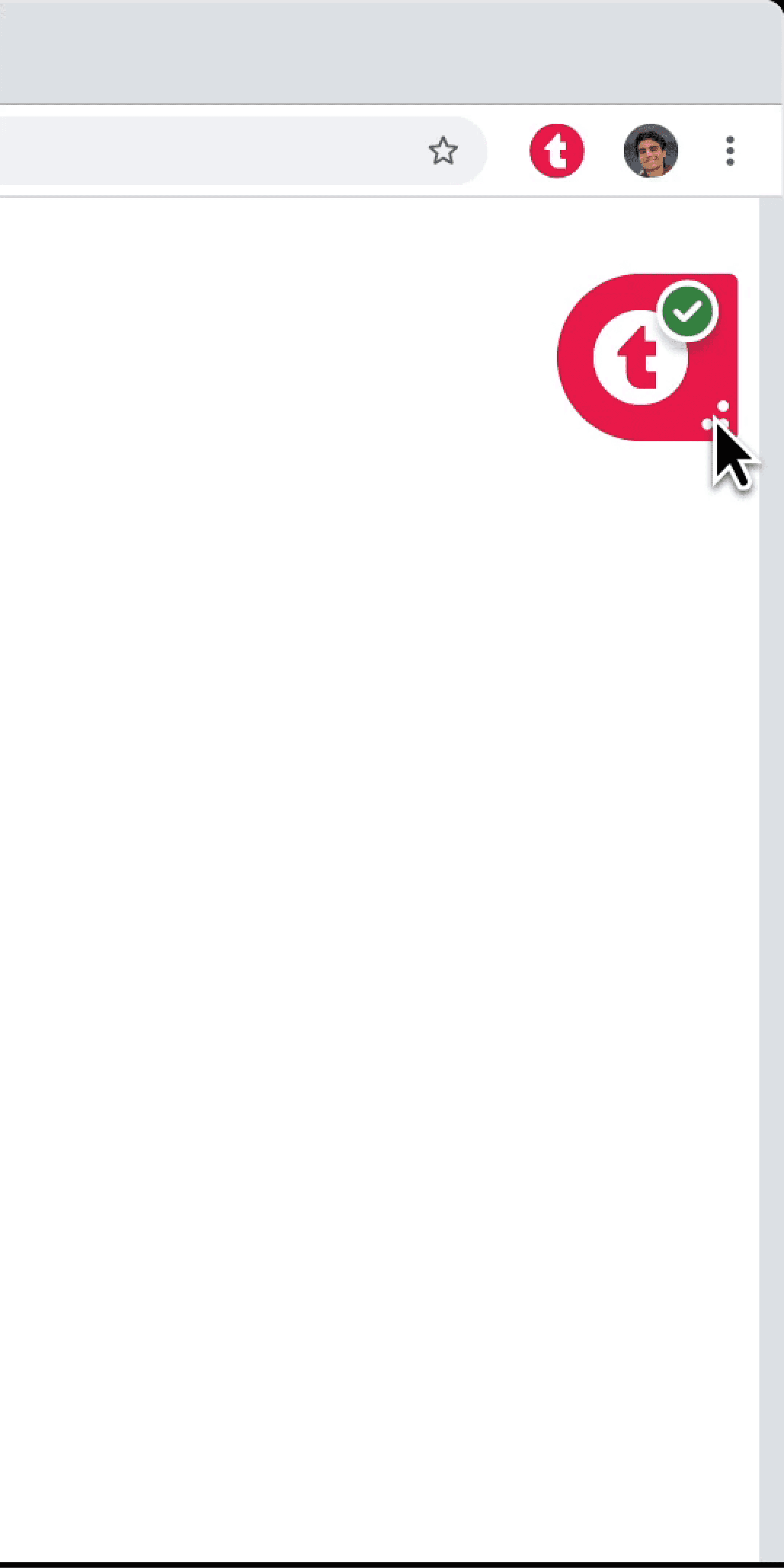
Active State and Widgets
06 The Design System and Other Visual Explorations
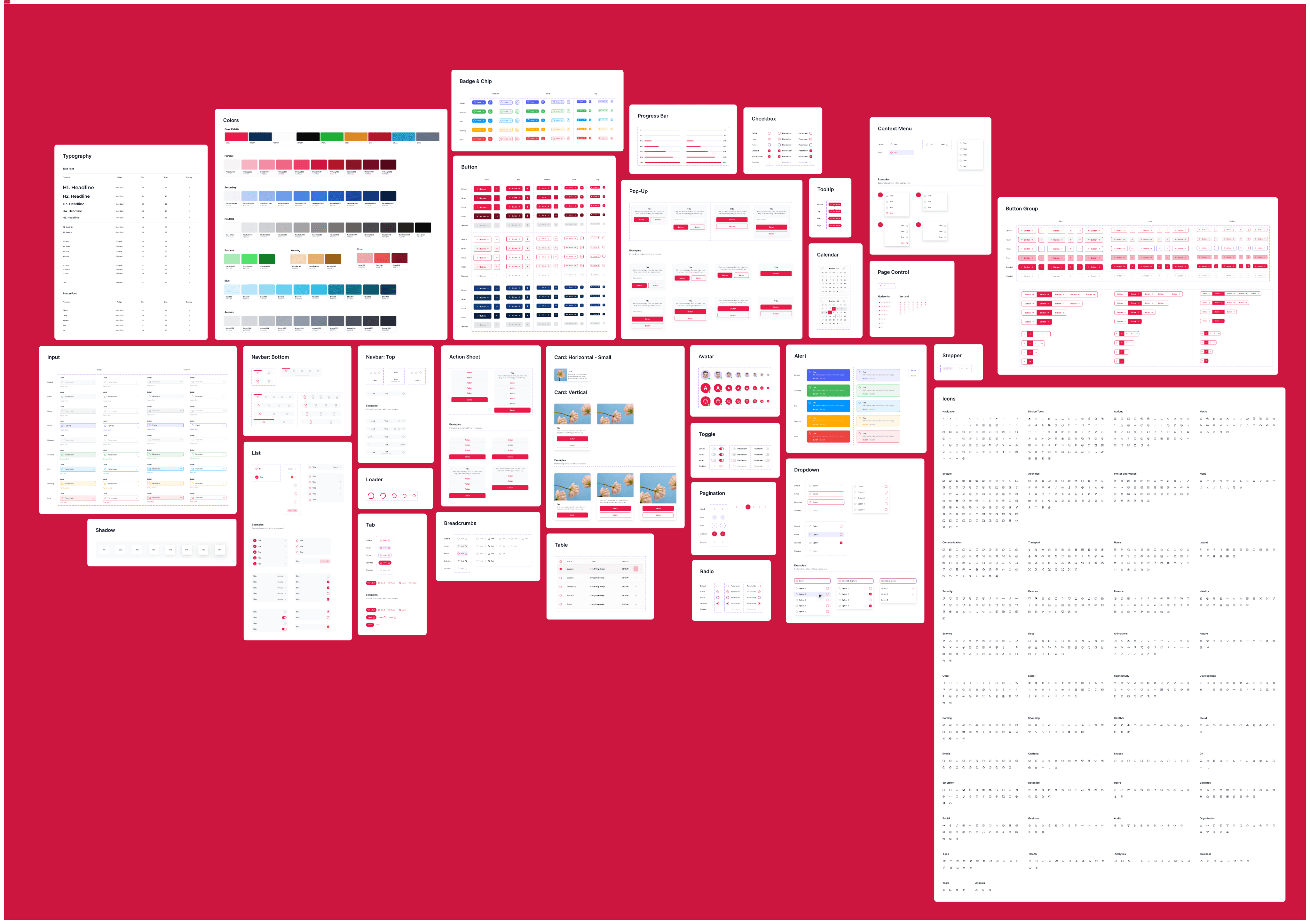
Tufa Design System
Color Palette
Typography
Montserrat
Inter
Flamingo
#E81A4A
Marine
#0D2857
Electric Blue
#189DC3
Wine
#720B23
Slate
#667085
Success
#1CB039
Warning
#DB8924
Error
#B31D1D
Base White
#FCFCFC
Base Black
#0b0a0a
Balancing trust and warmth
highly legible and approachable
modern and confident
The Design System
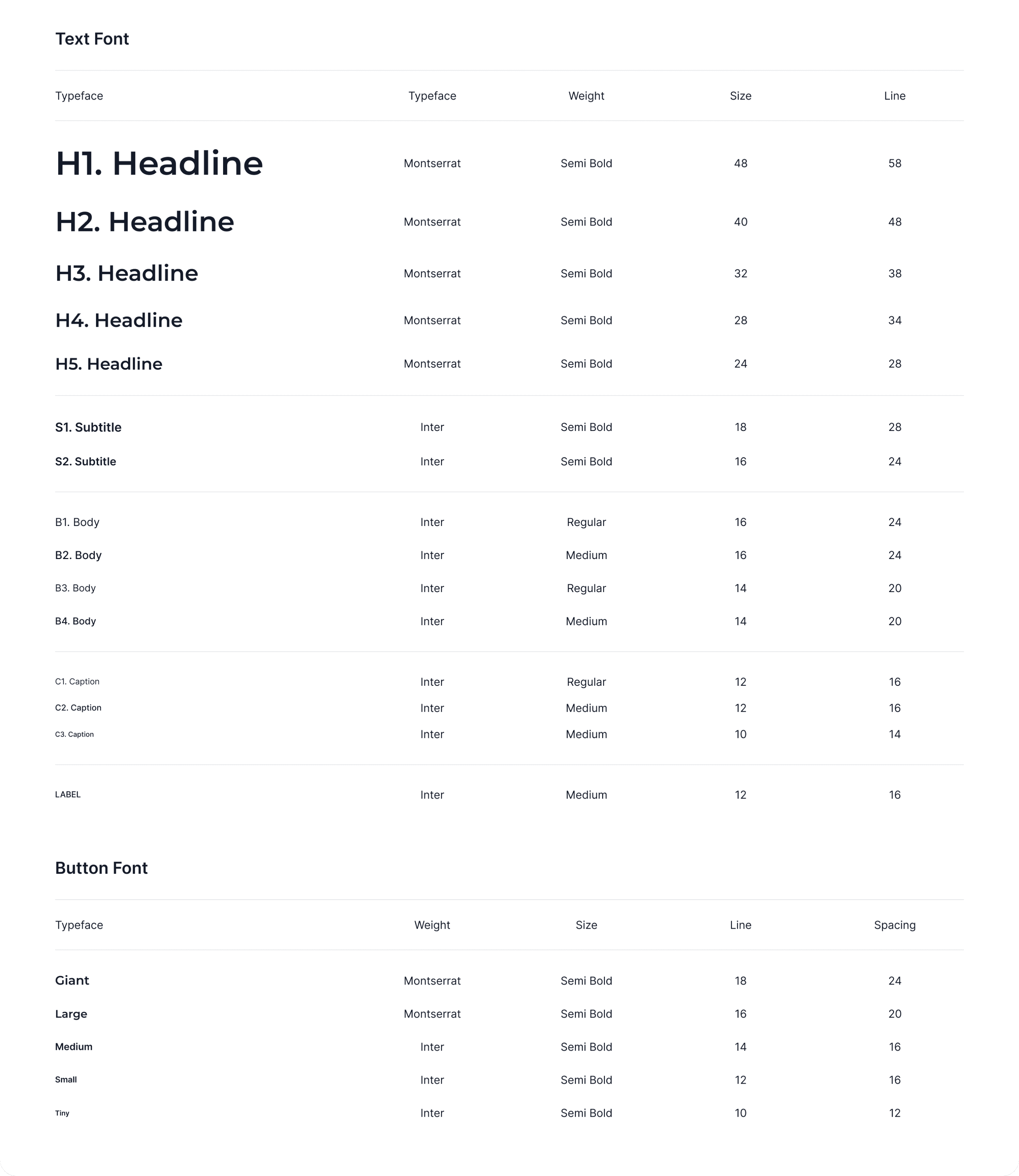
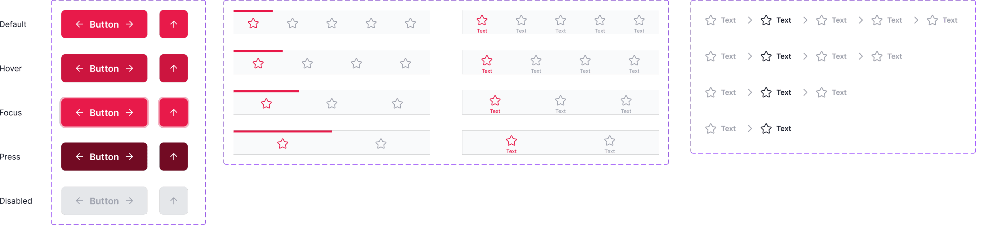
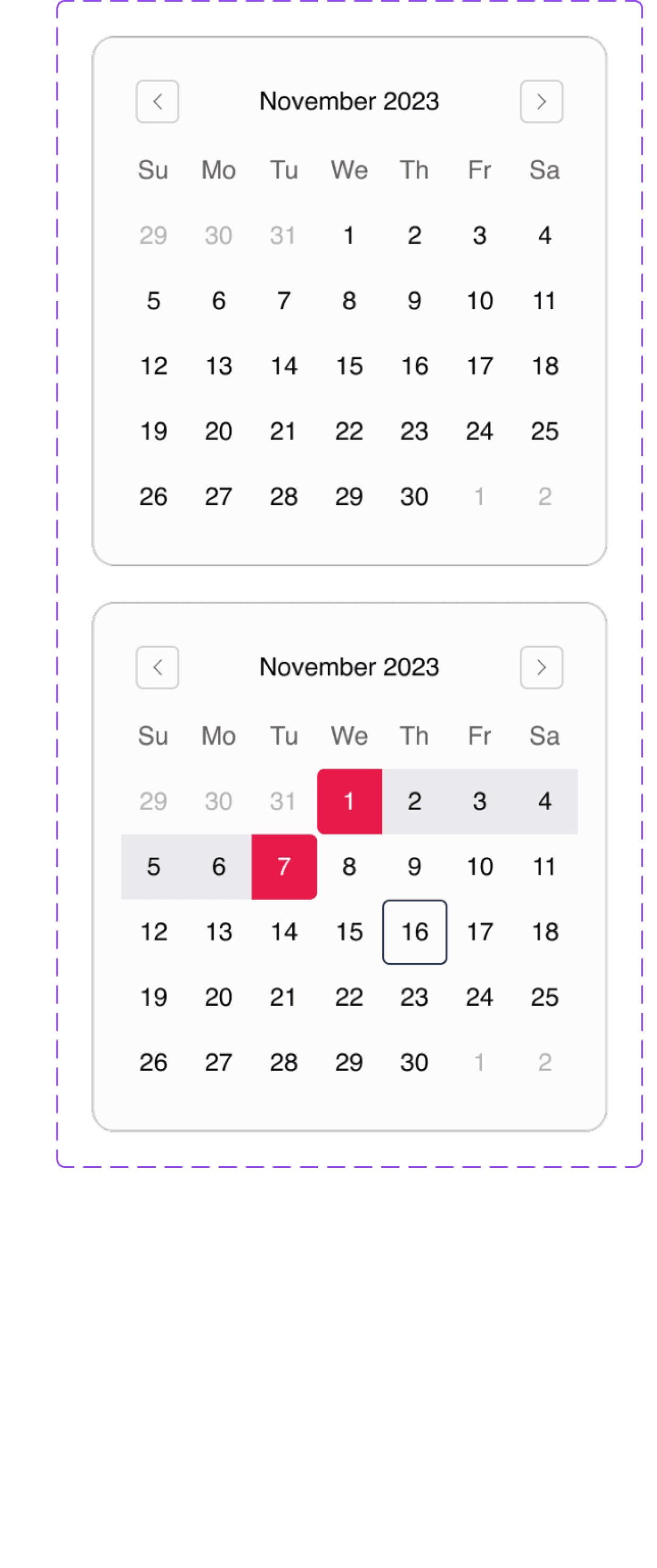
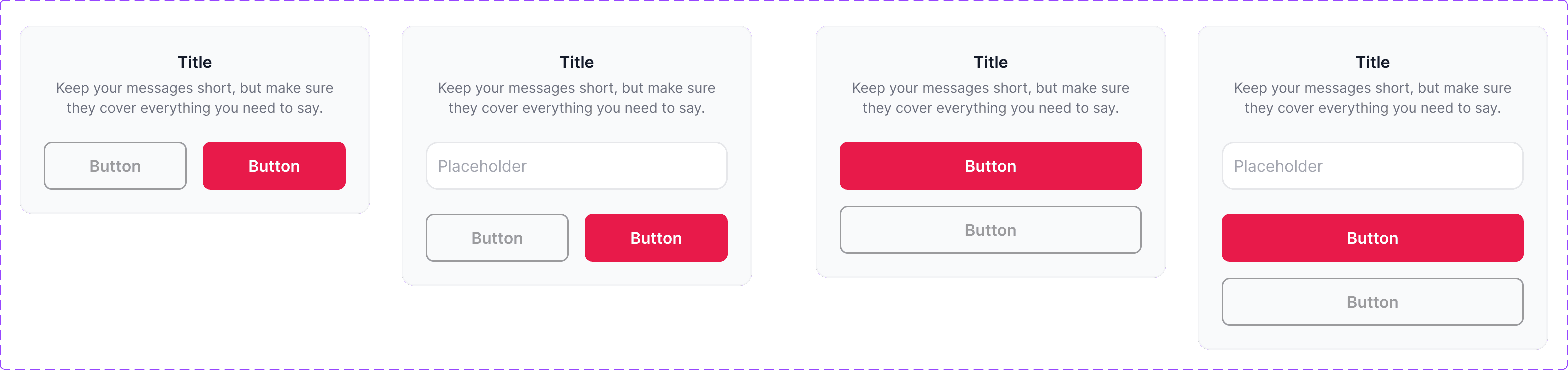
Designed with consistency and clarity in mind.
Defined all states and variants , tuned spacing, padding, and alignment, refined button hierarchy, and more!
The Design System
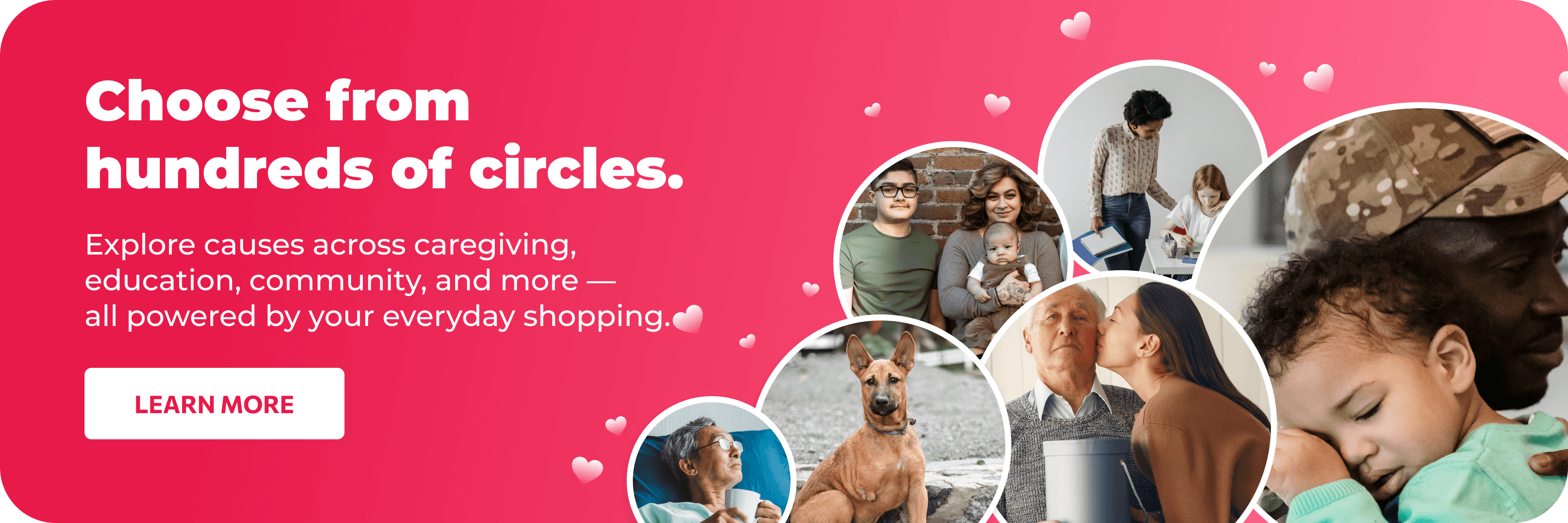


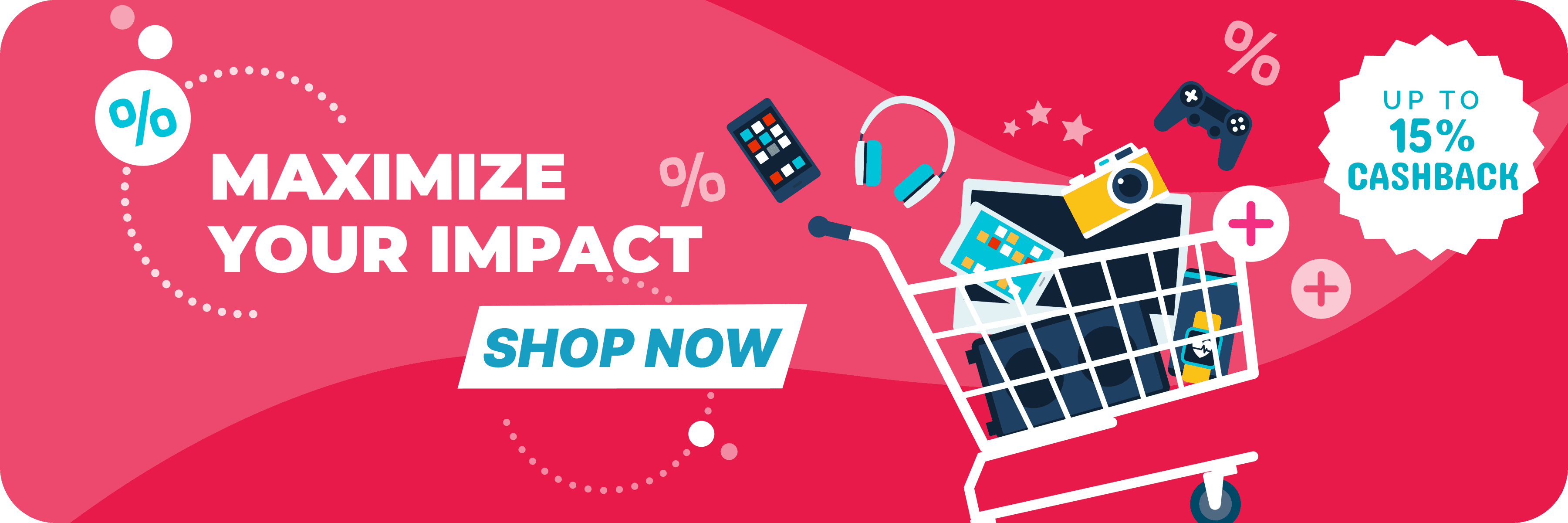

20+ Banners
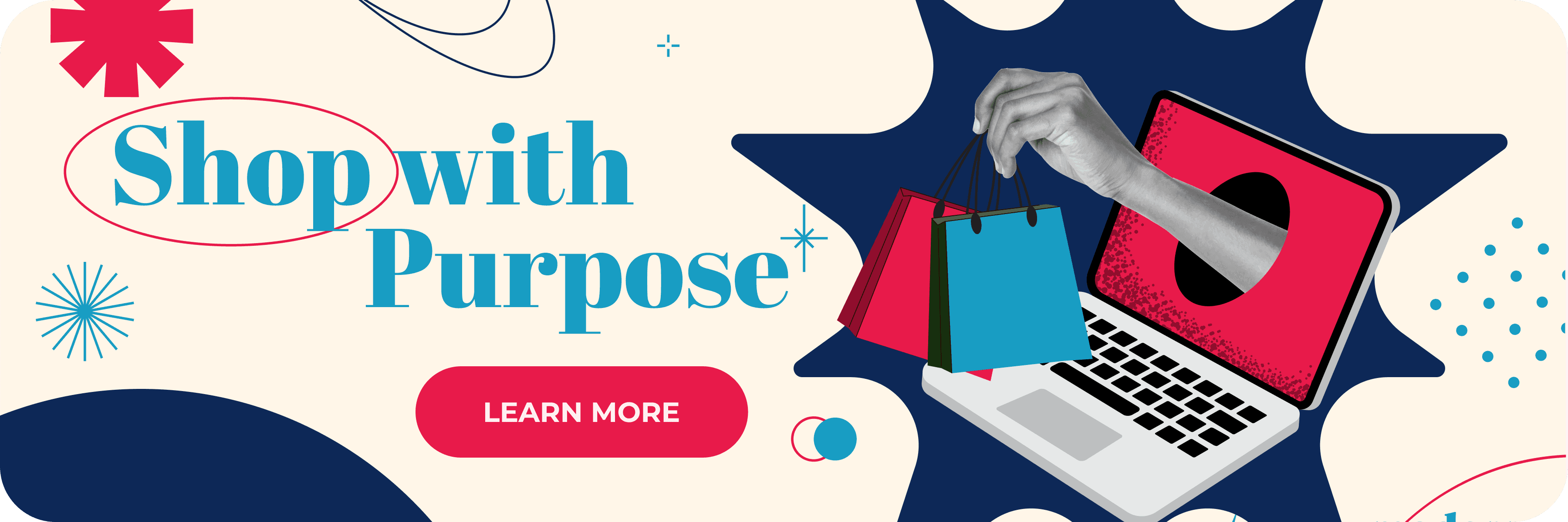
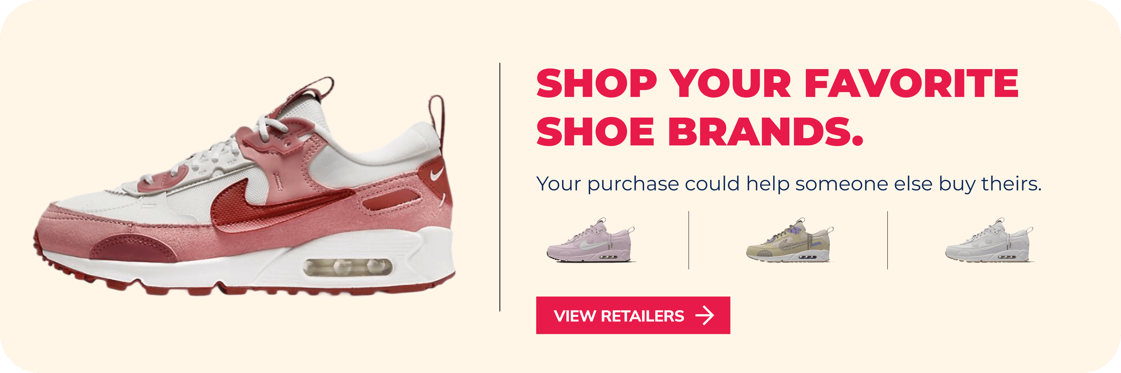
Dynamic banners that surface key actions and retailer deals
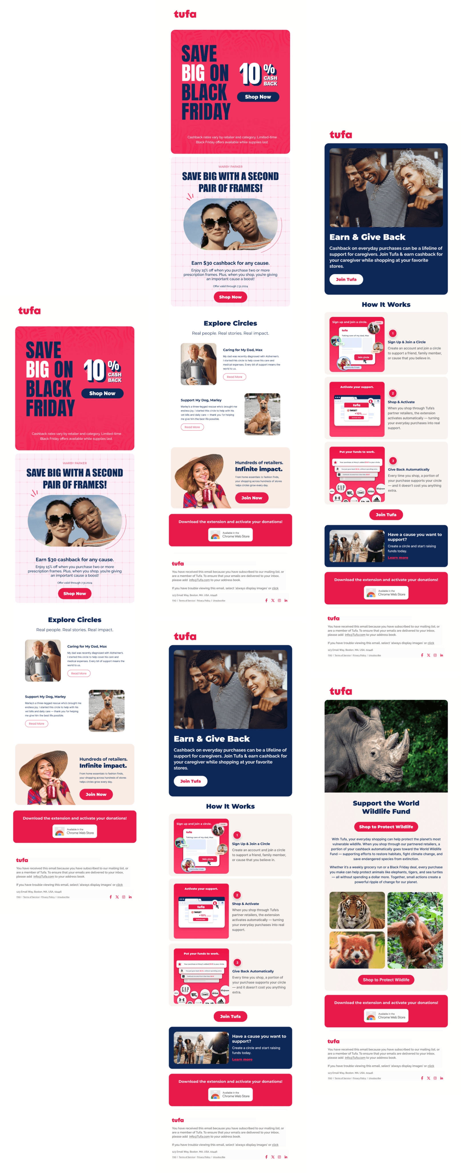
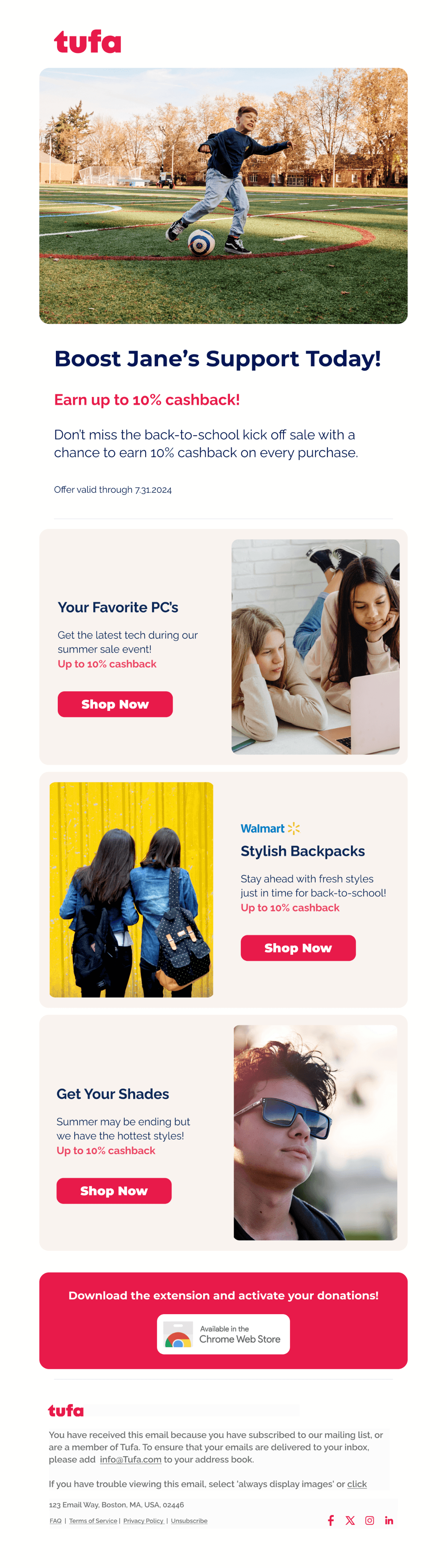
15+ Email Newsletters